Lupo Academy
Corporate image design for a sports coach
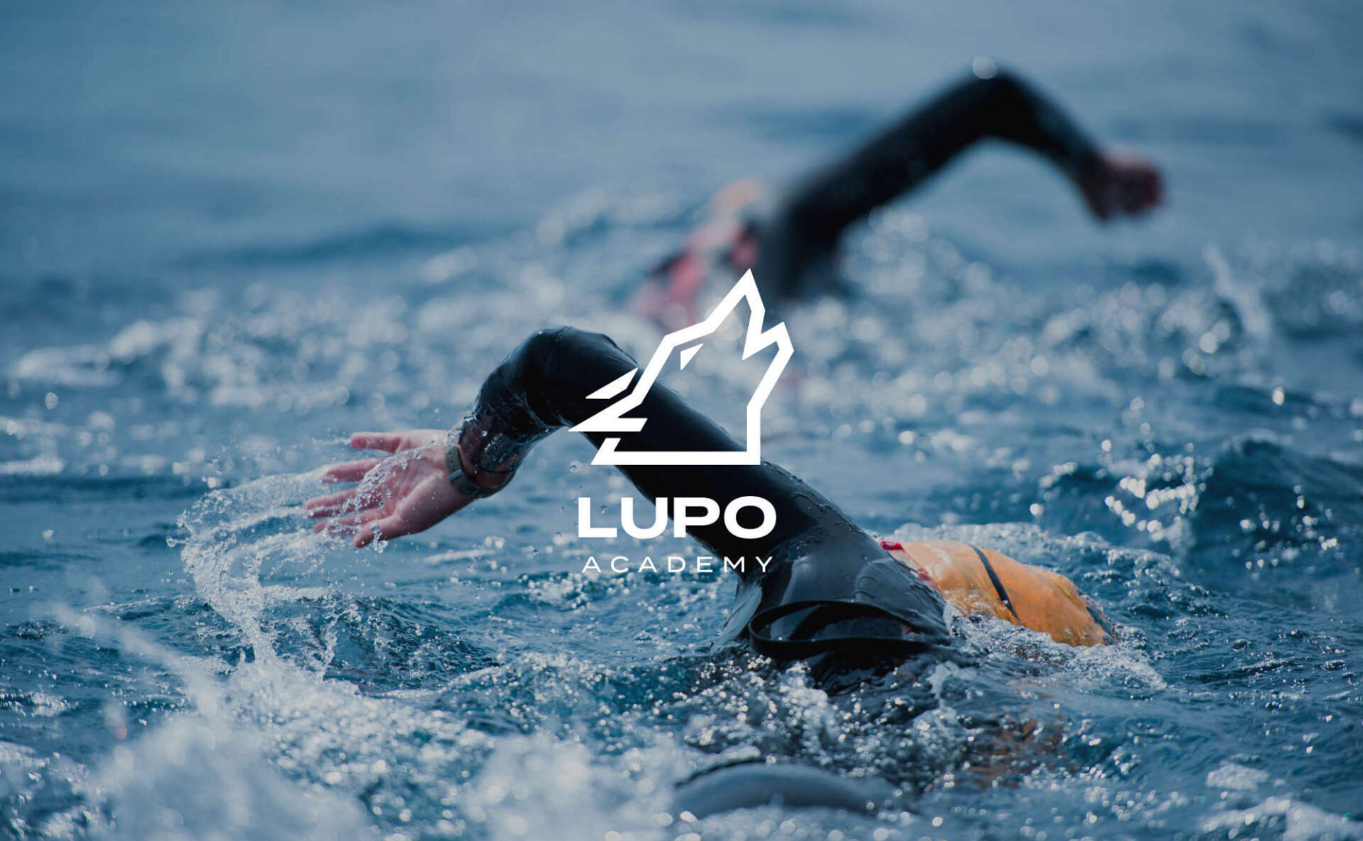
The corporate image design project for Lupo Academy, founded by Michele Olla “Lupo”, is a stimulating challenge that combines passion for sport and excellence in training. Lupo Academy is dedicated to preparing athletes of all ages for triathlons and this design aims to convey this dedication and professionalism in every aspect of its visual identity.
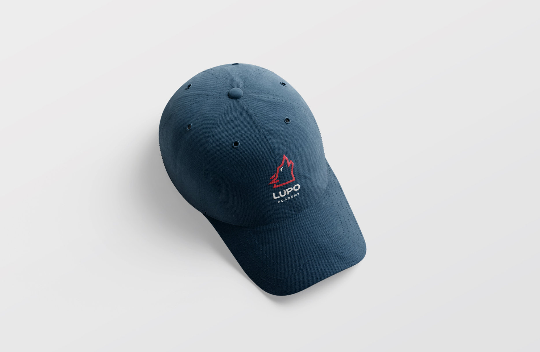
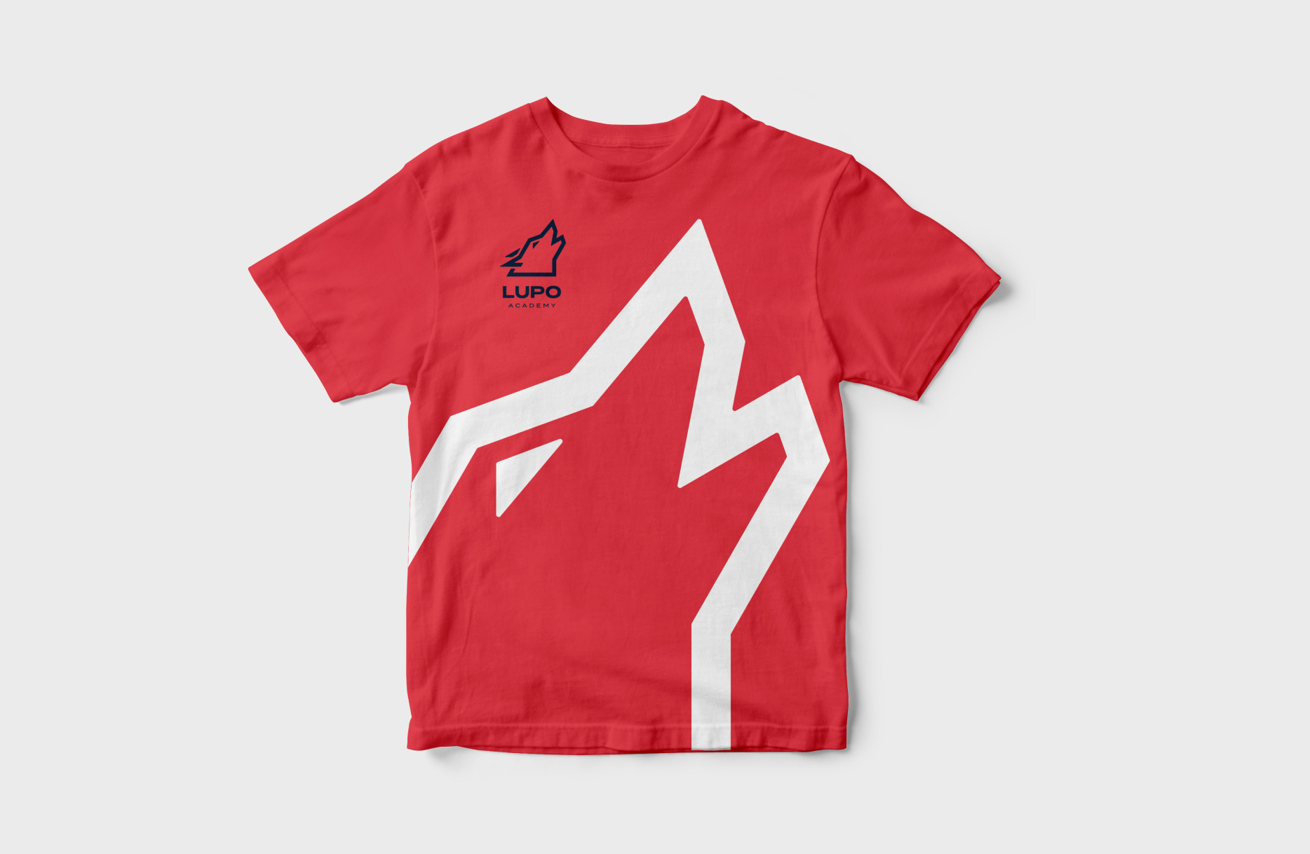
Starting with the t-shirts and caps, fresh and dynamic designs have been created to reflect the energy and competitive spirit of the triathletes. The colours chosen are vibrant and energetic, with a palette combining shades of blue, red and grey to represent water, fire and earth, essential elements in triathlons.
In summary, the corporate image design project for Lupo Academy is a visual representation of the academy’s commitment to the success of its athletes and their passion for triathlon.
A good corporate image creates a strong identity, builds trust, attracts customers, conveys professionalism and is the key to business success.

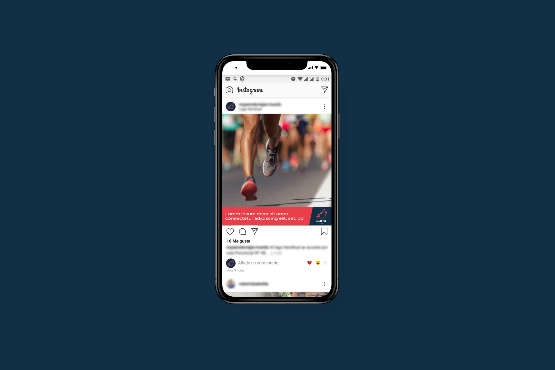
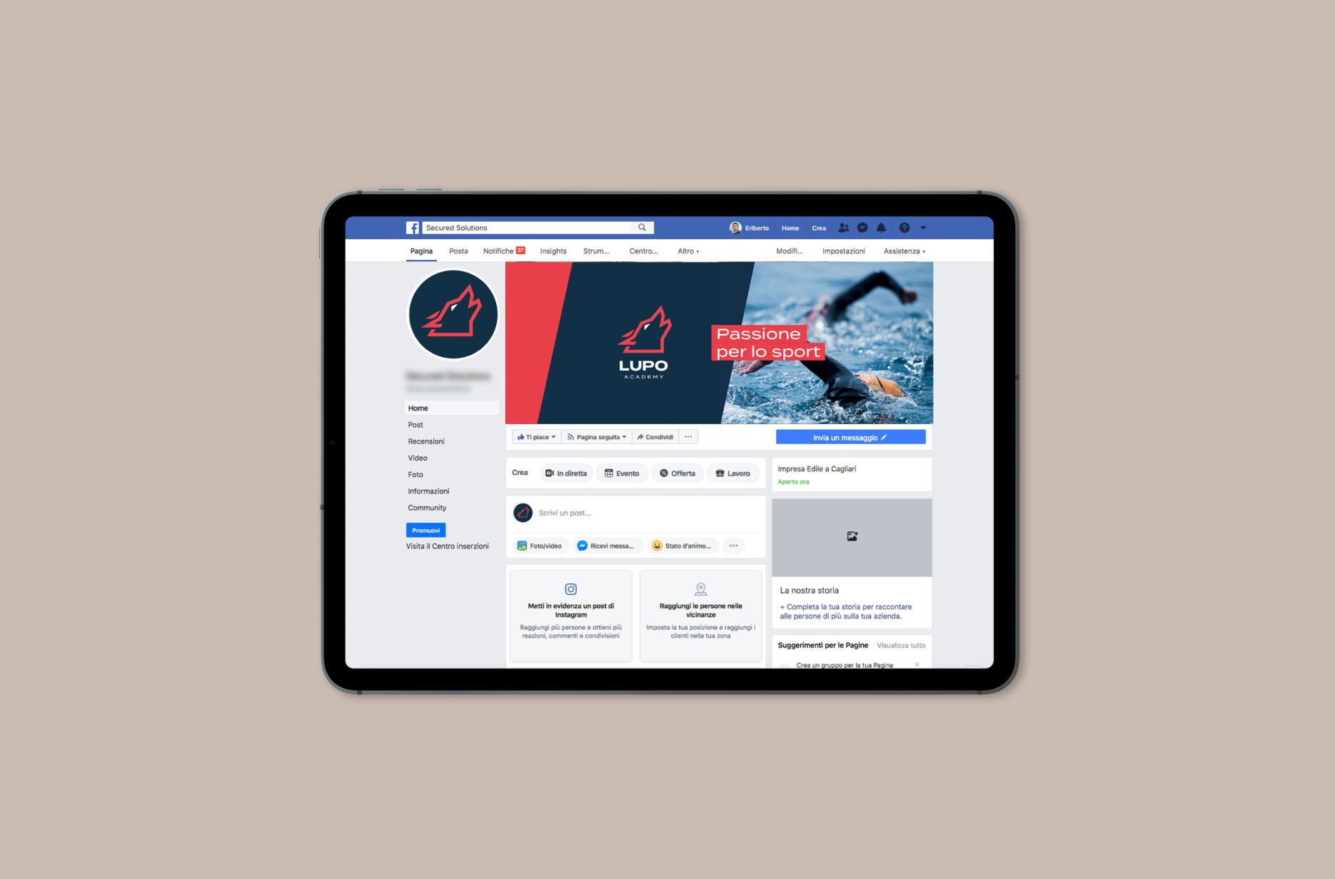
On social media, engaging visual content has been developed that highlights the achievements of Lupo Academy athletes, shares training tips and fosters the sporting community. The images and graphics reflect the passion and determination of the athletes and convey Lupo Academy’s commitment to success.
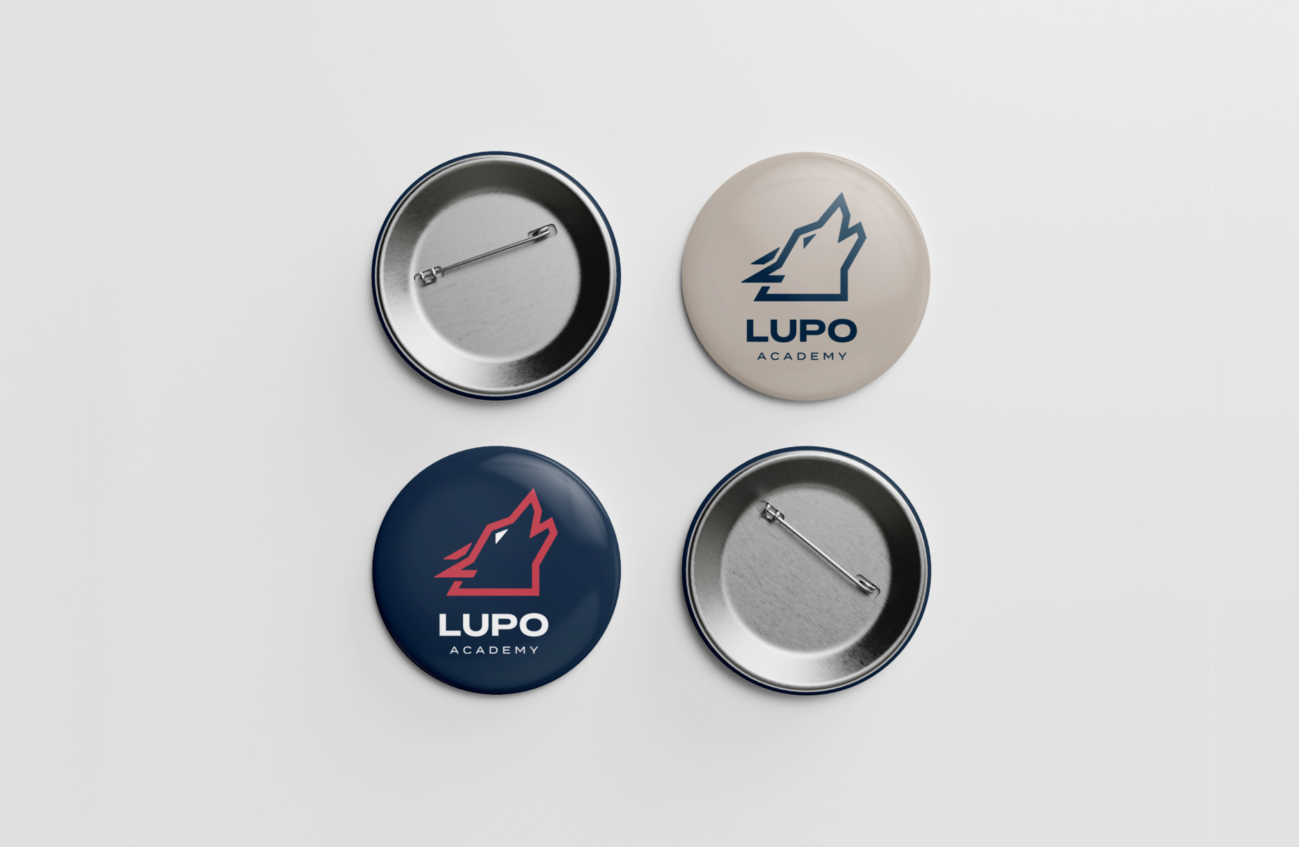
A corporate image manual has been created that establishes guidelines to ensure consistency in all promotional materials and communications. This includes rules for the use of logos, typography and corporate colours, ensuring that the Lupo Academy image is recognisable and professional at all times.
