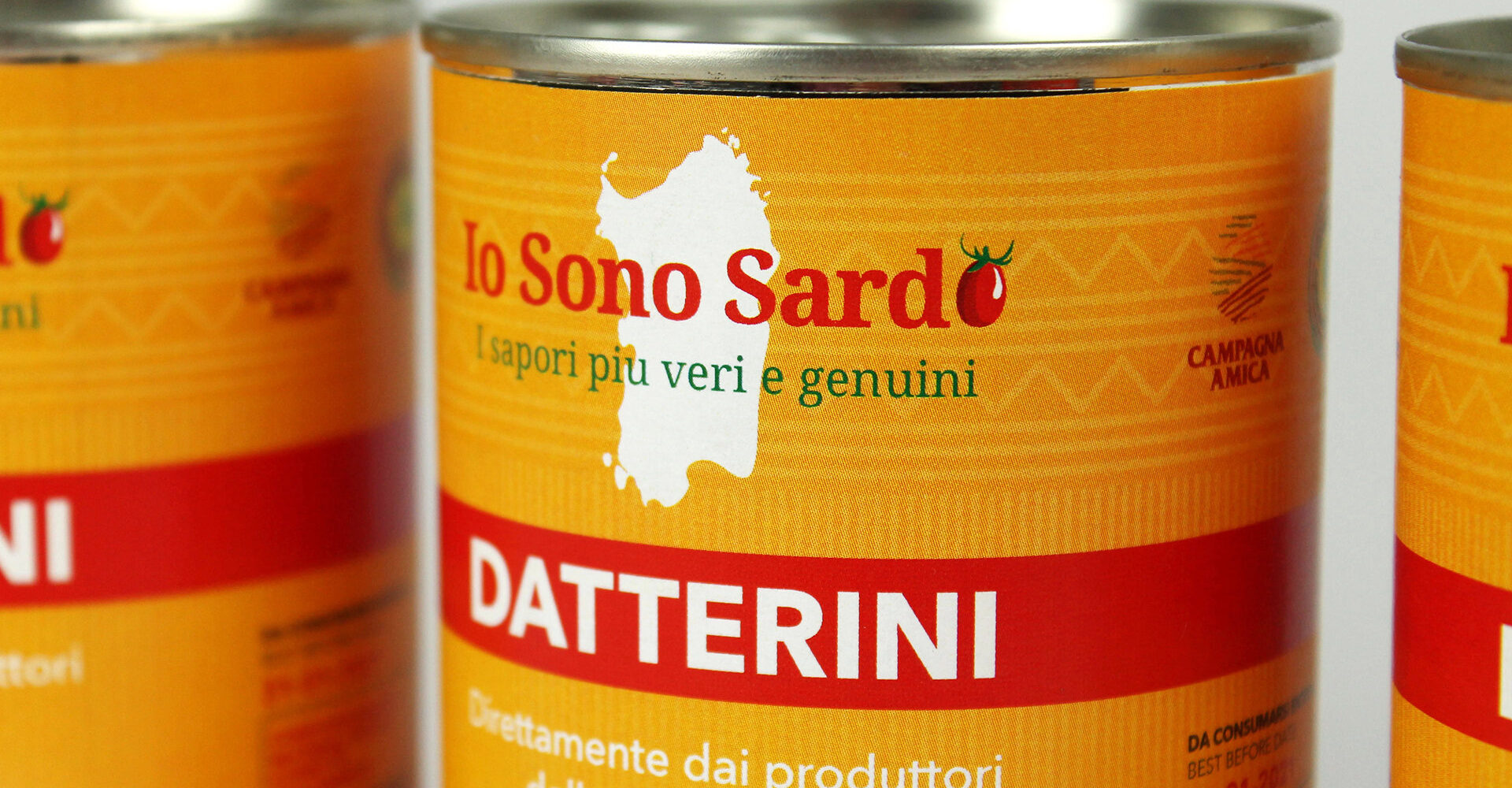
Io Sono Sardo
Redesign of the packaging for canned datterino tomatoes: a design that pays homage to the Sardinian territory, maintaining the visual continuity of the brand
The project to redesign the packaging for Io Sono Sardo brand canned datterino tomatoes was the first step in a broader intervention, designed to revamp the entire product line, harmonise the brand image and reinforce its identity.
The aim was to create a contemporary design that would renew the visual appearance without losing continuity with the brand’s history and Sardinian roots, while enhancing the authenticity of the product. At the same time, the logo was redesigned to ensure greater visual consistency and reinforce the communicative impact of the entire line.
Among the distinctive elements of the project are the photograph of a traditional Sardinian basket full of cherry tomatoes, enhanced by the institutional colours of yellow and red, and the graphic motif inspired by the decorations of the Giants of Mont’e Prama, a reference to Sardinia’s millennial history and an element of strong personality in the packaging.
BEFORE

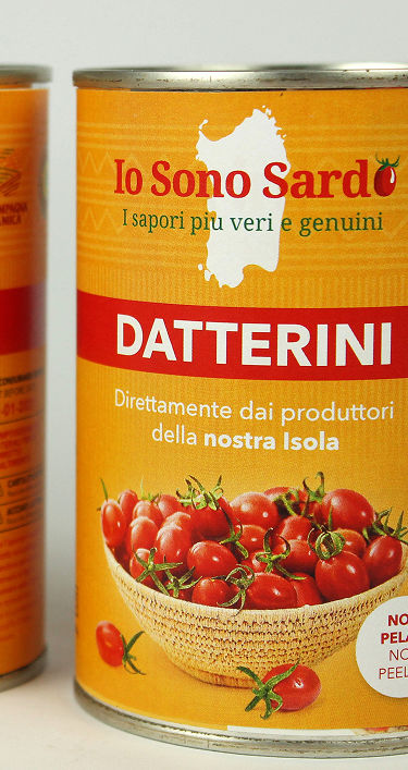
AFTER

Modern and functional design, carefully crafted to enhance corporate identity and reinforce brand recognition.


Ingredients, nutritional information, instructions and certifications are clearly and comprehensively included, ensuring functionality, transparency and consistency with the brand image and recognition.