In the field of engineering and structural diagnostics, corporate image plays a crucial role. It is not just a matter of aesthetics, but of conveying safety, precision, reliability and innovation. This was the main challenge in the restyling of the corporate image of Secured Solutions, a company based in Cagliari (Italy) specialising in structural diagnostics. The project sought to modernise its visual identity without losing the values that have positioned it as a benchmark in its sector.
Secured Solutions: experience and leadership in structural diagnostics
Secured Solutions is a leading company in engineering and structural diagnostics, with extensive professional experience and a strong commitment to safety. Its activity is based on technical analysis, risk prevention and structural assessment of buildings and infrastructure.
Before the redesign, the corporate image already communicated professionalism, but it needed to evolve to more clearly reflect its innovative capacity, technological focus and adaptation to the new visual standards of today’s market.
Preliminary analysis: defining values and visual objectives
Every effective restyling project begins with an analysis phase. In this case, a detailed study was carried out of the company, its positioning, its competition and current trends in corporate design within the technical and industrial sector.
Based on this analysis, the key values that the new identity should convey were defined: solidity, trust, professionalism, innovation, and security. These concepts became the strategic foundation on which the entire visual system of Secured Solutions was built.
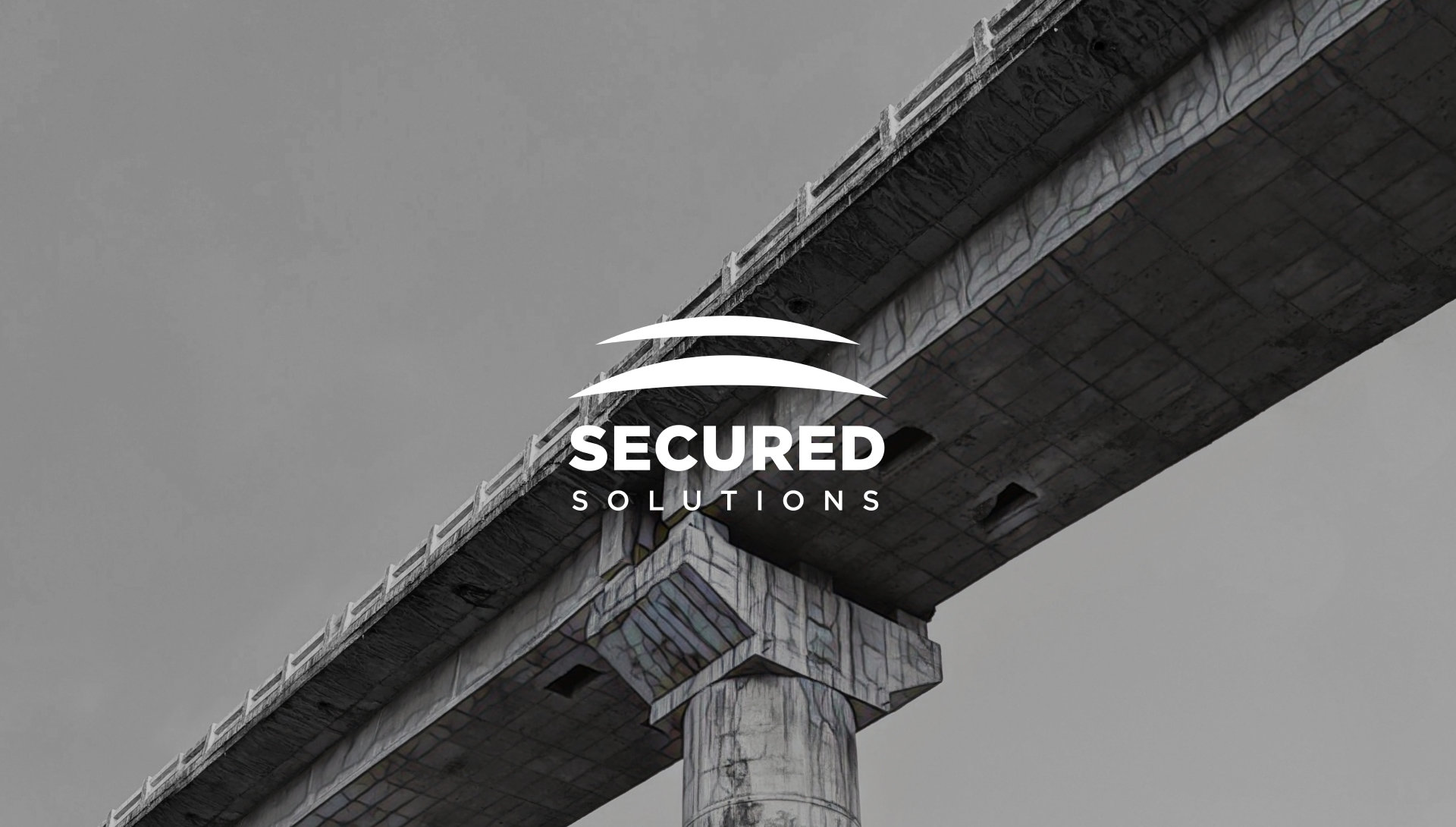
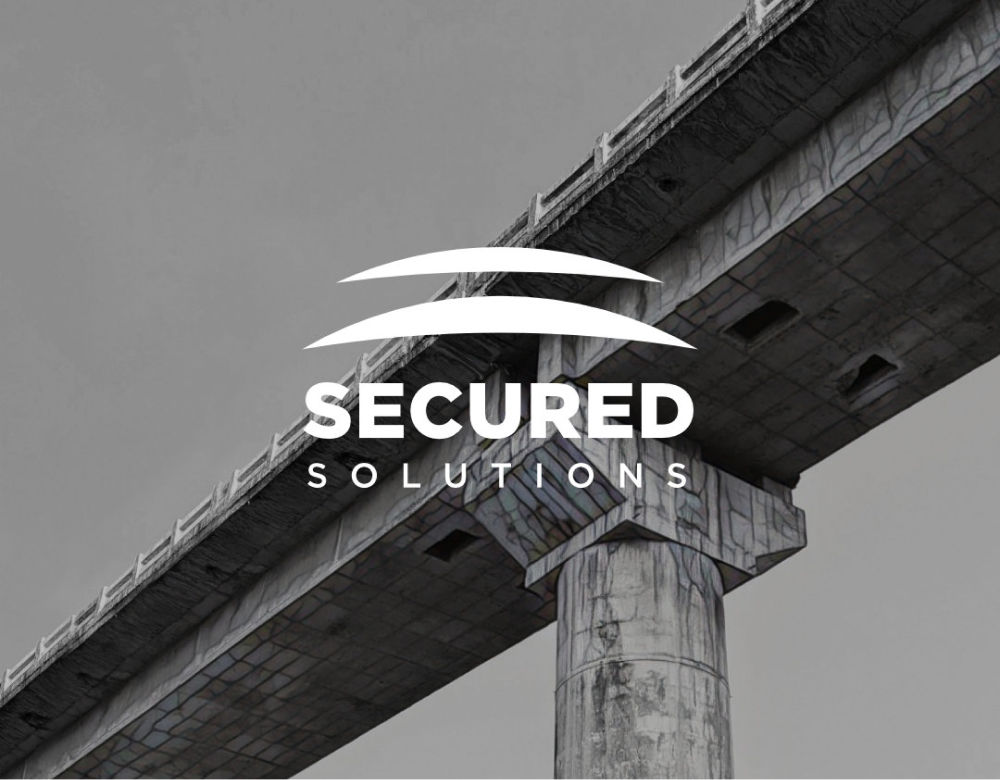
Logo redesign and new visual identity
The logo was one of the central elements of the project. We opted for a modernisation that would maintain the essence of the brand, but with a more contemporary and cleaner visual language. The forms were simplified and their proportions were redefined to achieve greater functionality and a more appealing visual impact. These decisions contribute to a perception of stability and technical rigor, complemented by typographic adjustments that improve legibility and reinforce a sense of reliability.
The new colour palette plays a fundamental role: sober, professional colours that evoke stability, precision and control. This colour combination allows for consistent application in both print and digital media, ensuring a solid and recognisable identity.
Corporate applications: consistency in every detail
A visual identity is not complete without proper application across different corporate media. In this project, Secured Solutions’ new image was implemented on business cards, letterhead, notepads and corporate folders.
Each piece was designed following the guidelines of the new visual system, paying close attention to the hierarchy of information, the use of colour and the correct application of the logo. The aim was to project a professional and consistent image at every point of contact with customers and partners.

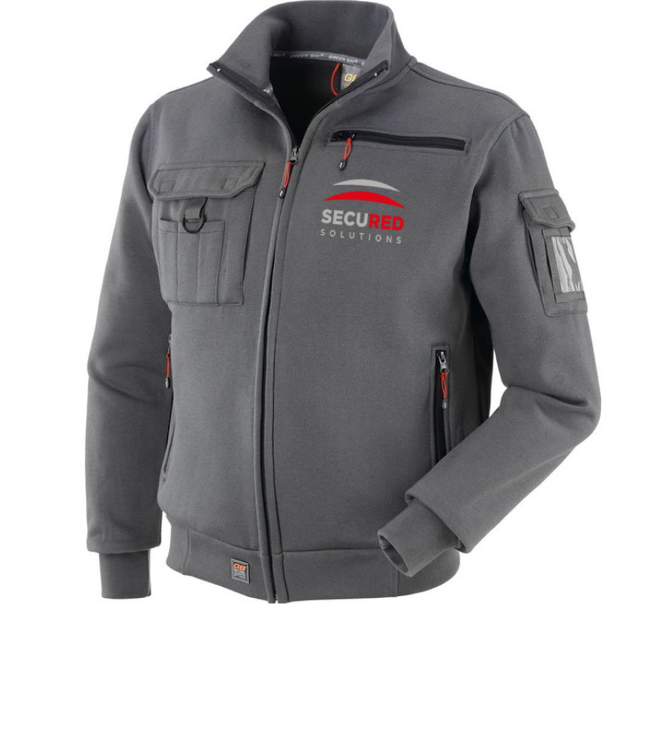
Workwear, vehicles and corporate identification
The redesign also addressed key elements of the company’s physical identity. The image of workwear, ID and access cards, and corporate vehicle signage was improved.
These elements are particularly important in technical companies, as they reinforce brand visibility in real working environments. A well-executed design on uniforms and vehicles conveys order, professionalism and confidence, essential values in the structural engineering sector.


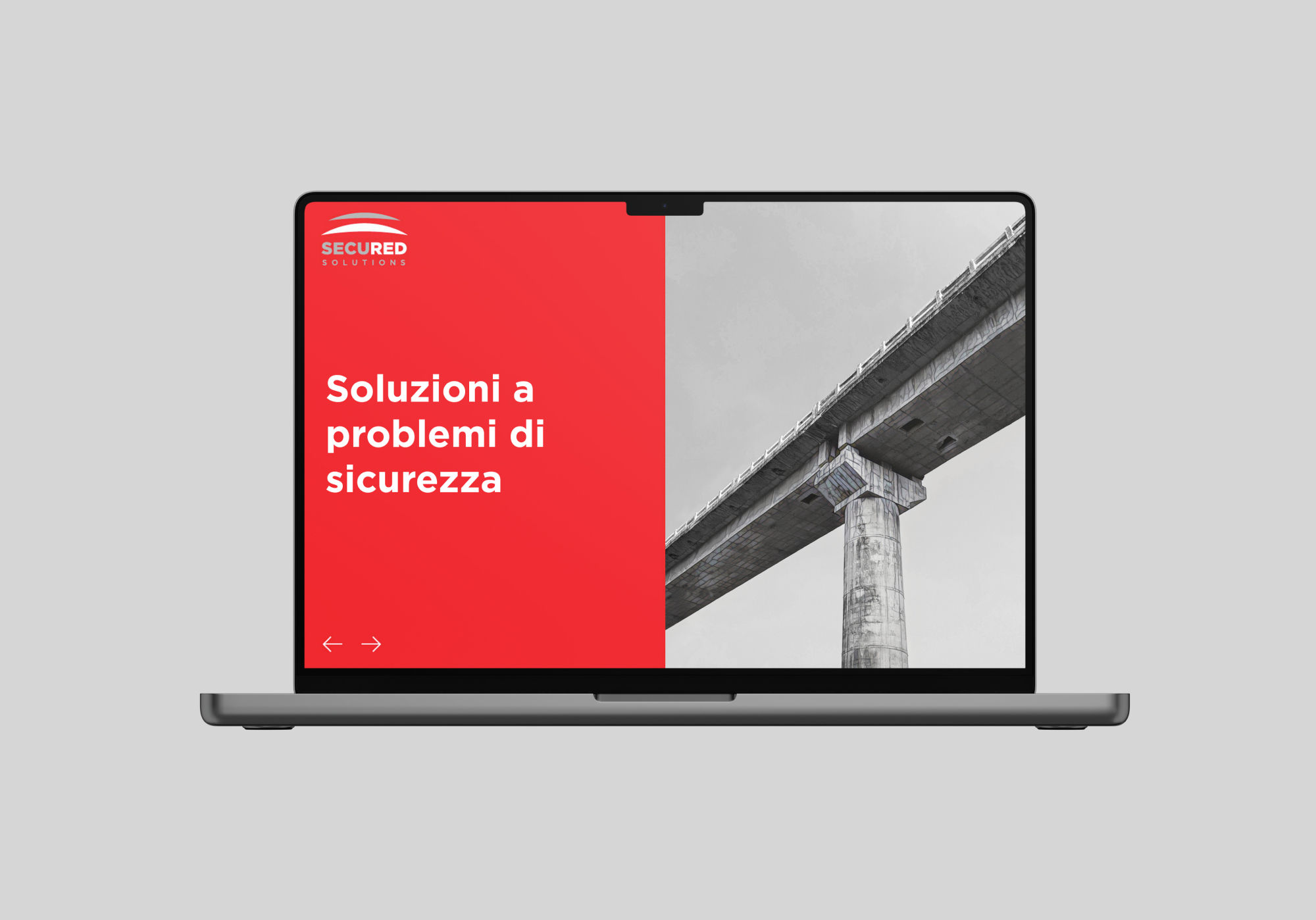
Website redesign: an identity adapted to the digital environment
An essential step in any corporate image renewal project is the redesign of the website. In the case of Secured Solutions, a website was developed in line with the new visual identity, with a clean, professional and usability-oriented design.
Adaptability and responsiveness were guaranteed on all types of devices, especially mobile, ensuring a smooth user experience consistent with the corporate image. The website thus becomes a key communication tool, reinforcing the company’s credibility and leadership.
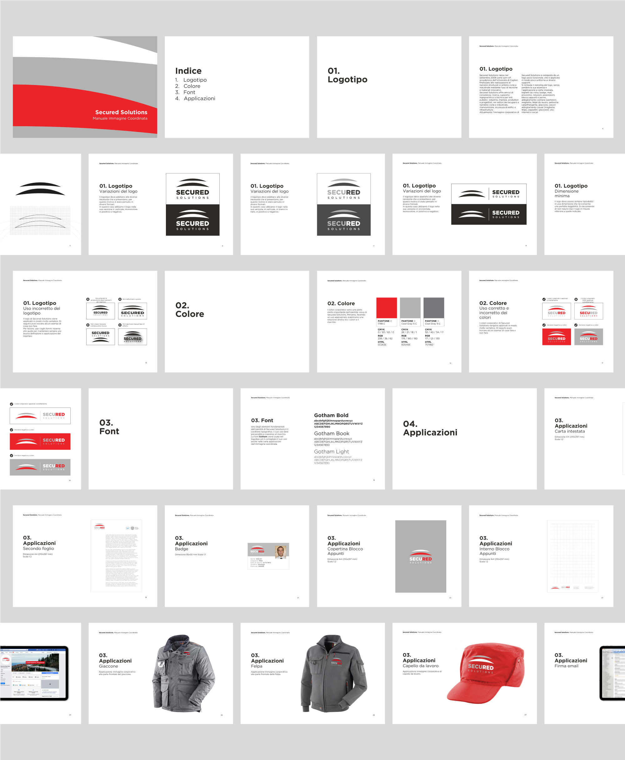
Corporate identity manual: the key to consistency
To conclude the project, a corporate identity manual was developed, an essential element in any professional restyling. This document establishes the rules for using the logo, typography, colours and graphic applications, ensuring visual consistency in all company communications.
The manual ensures that Secured Solutions’ identity remains strong and consistent over time, regardless of the medium or team applying it.

Conclusion: an image that reinforces confidencefianza
The restyling of Secured Solutions’ corporate image demonstrates how strategic graphic design can enhance the perception of a technical company. The result is a modern, consistent and professional identity that reinforces its leadership position in structural diagnostics and clearly conveys its core values: safety, innovation and experience.
Do you need to revamp your corporate identity? If your brand has evolved and its image no longer reflects who you are, it’s time to take the plunge. We design solid, consistent and strategic corporate identities, designed to communicate trust, professionalism and differentiation.
Contact us and let’s work together on an image that represents the true value of your company.