Fondazione Villanovafranca
Corporate image project for the Villanovafranca Foundation
The corporate image project for the Villanovafranca Foundation aims to strengthen the visual identity of the organisation and to consistently communicate its cultural and social mission. Through accessible and innovative initiatives, the Foundation promotes the territory’s heritage, contributing to its cultural renaissance. The new identity reflects the values of culture, sustainability and community, highlighting the deep connection with local history and roots.
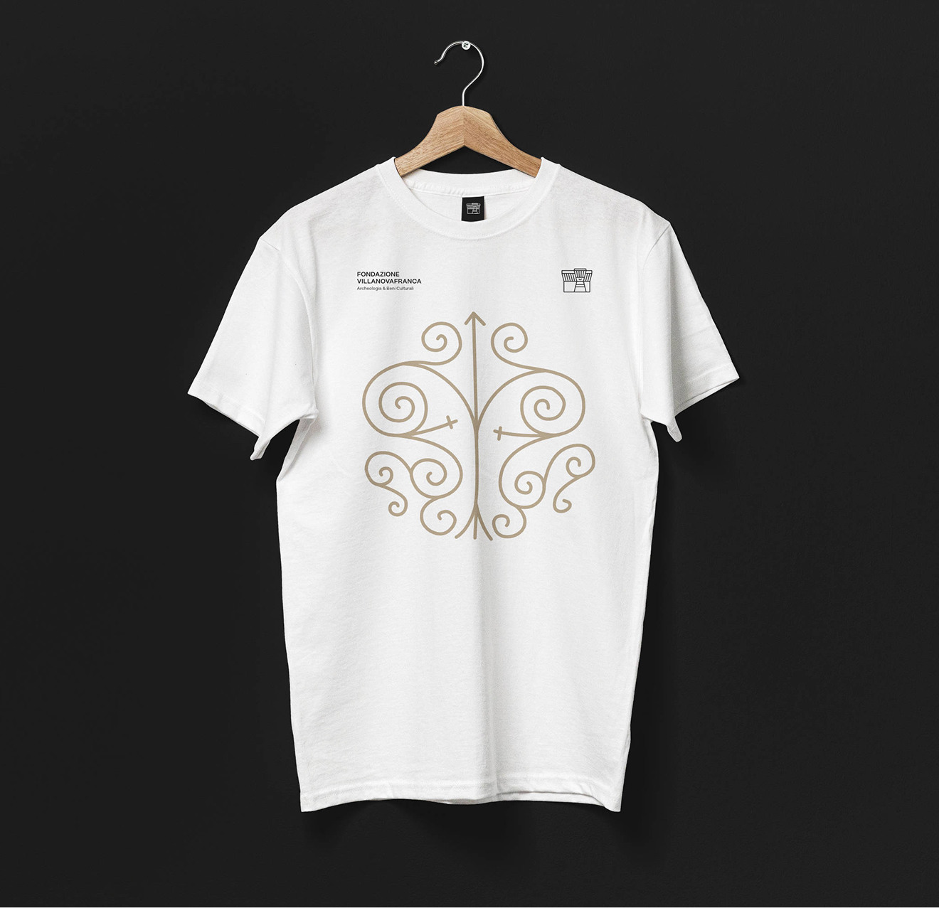
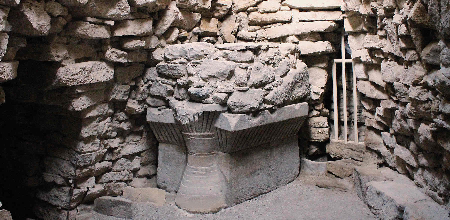
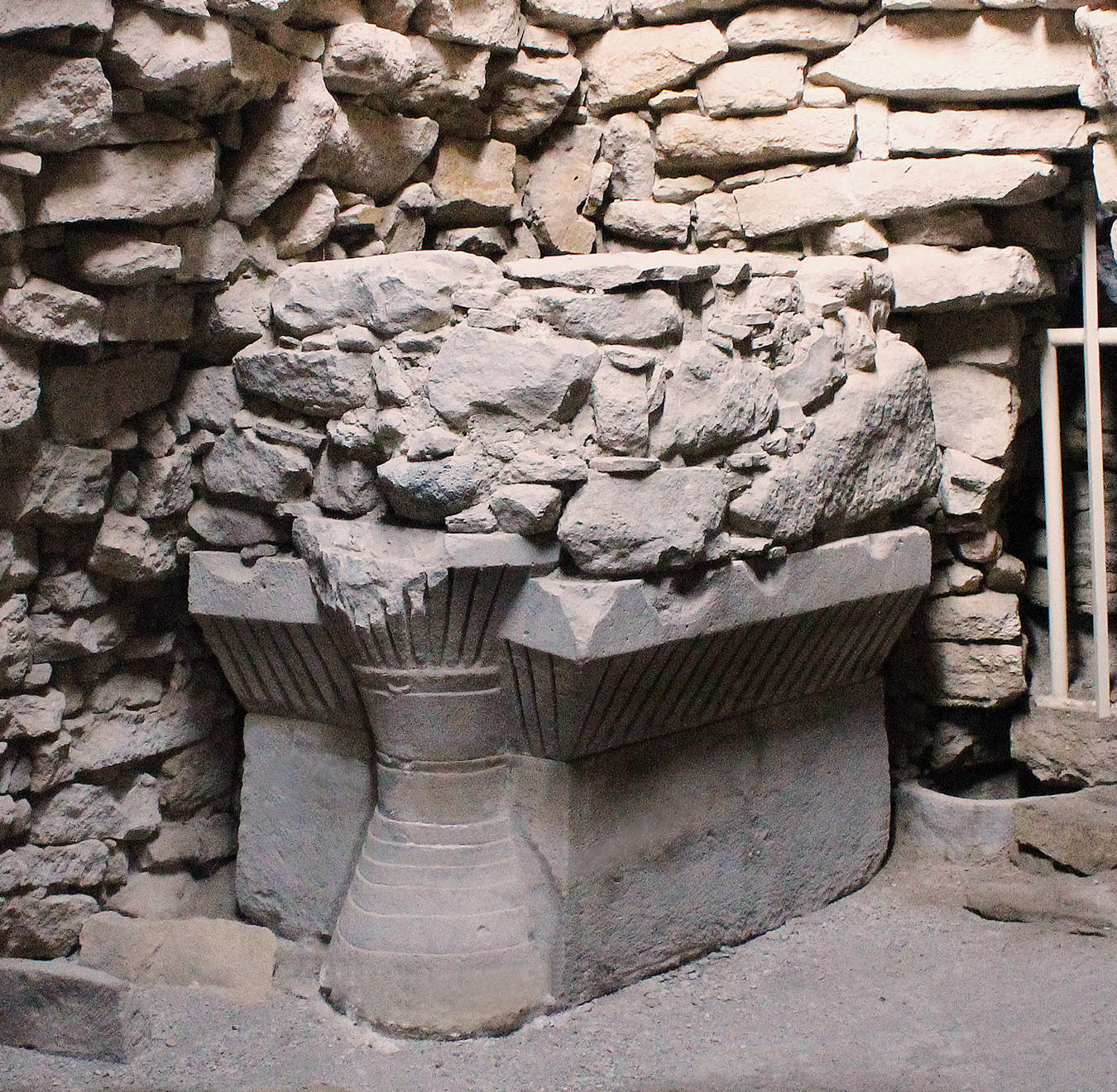
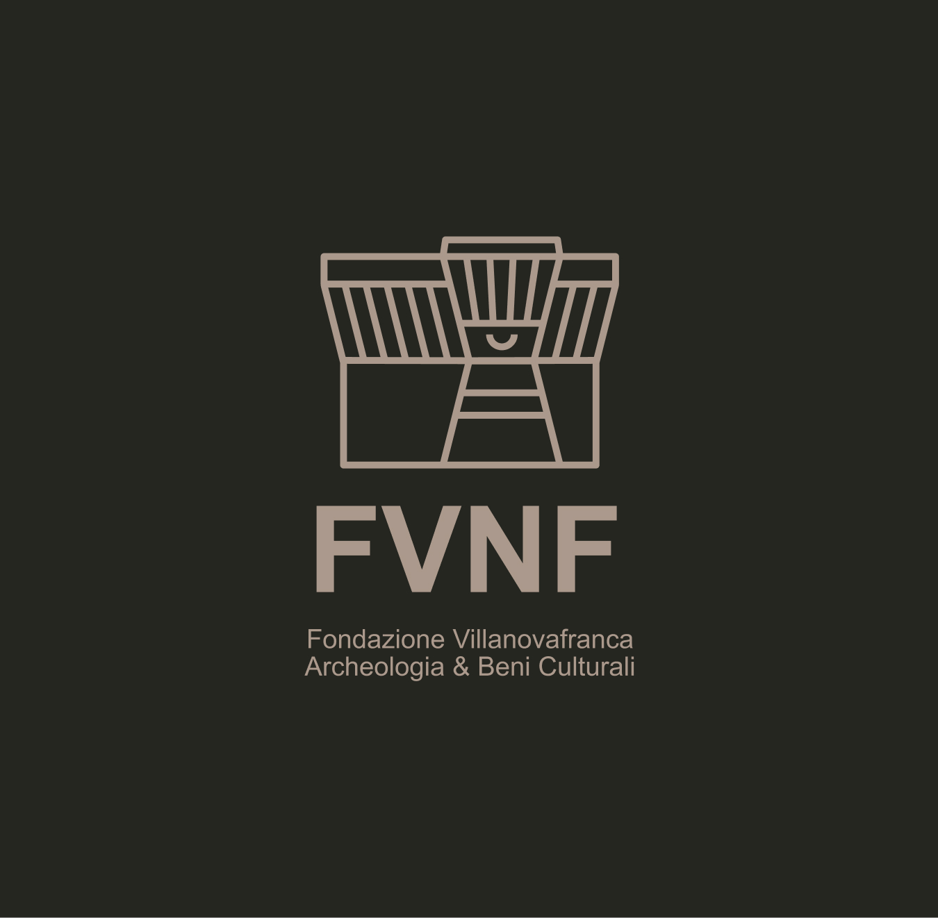
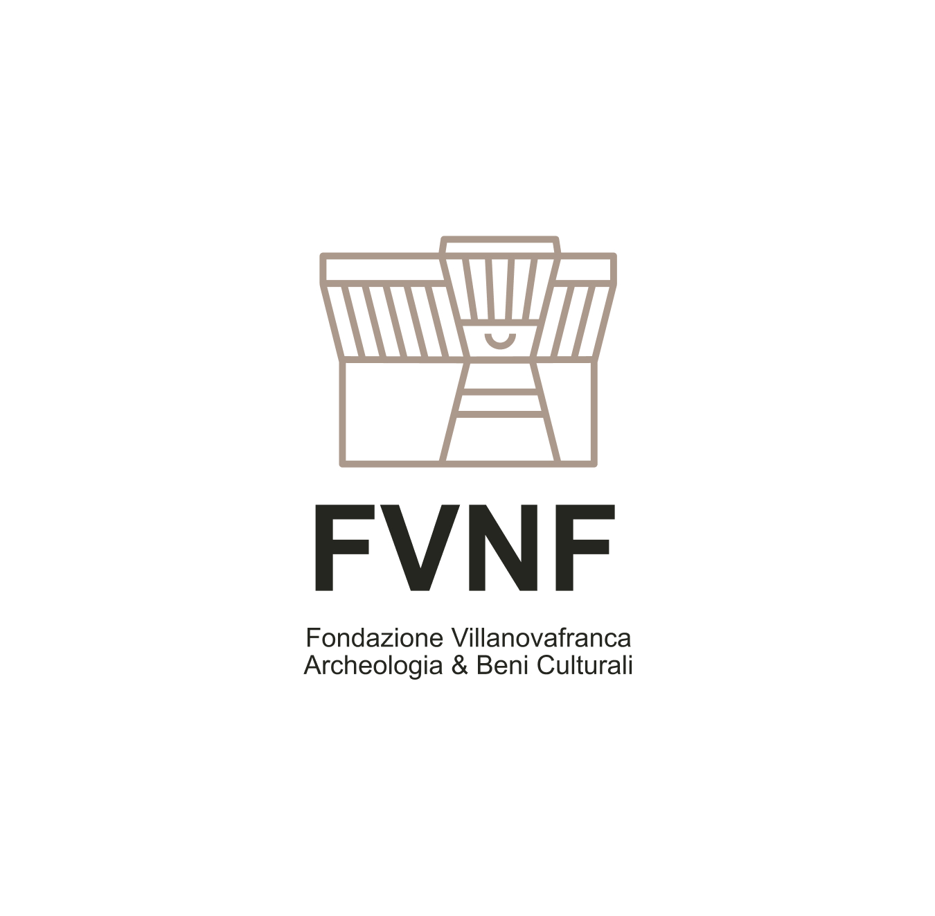
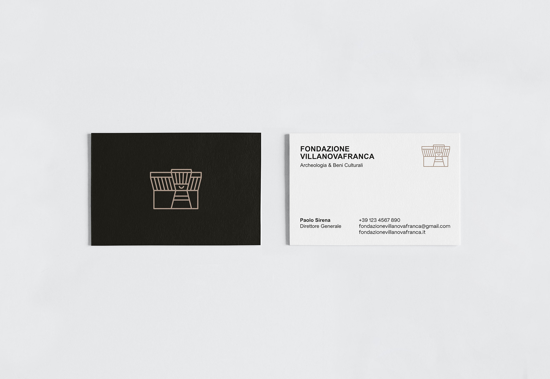
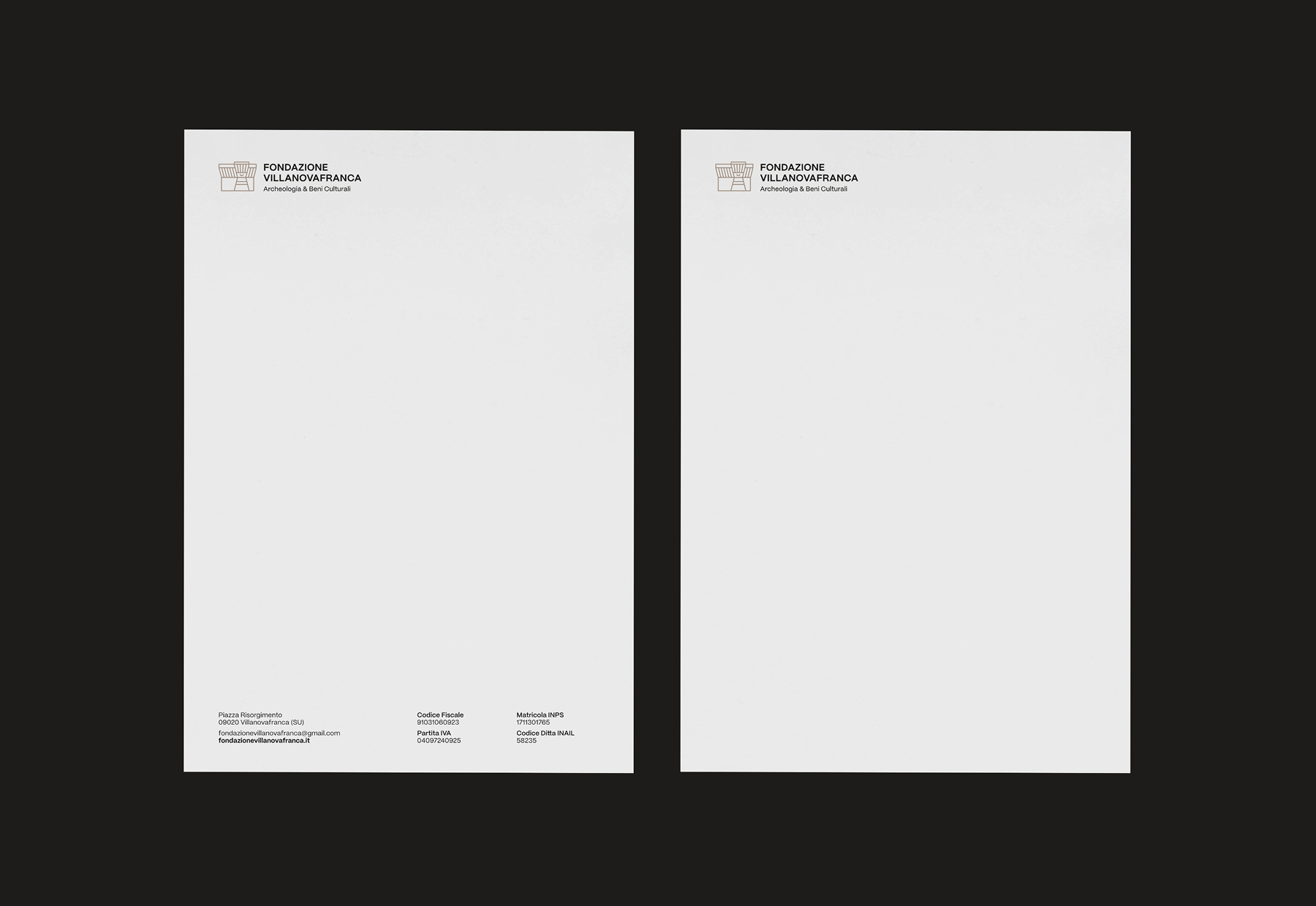
The central element of the new image is the imagotype, inspired by the Nuragic altar of the Nuraghe Su Mulinu, one of the most significant symbols of the local archaeological heritage. The graphic sign takes up the forms of the altar, with a particular reference to the crescent moon carved on its front, interpreted as a reference to the ritual and symbolic dimension of the Nuragic culture, as well as a metaphor for rebirth, cyclicity and connection with nature.
The revamped visual identity enables the Foundation to communicate its services, projects and activities more effectively, strengthening the organisation’s recognisability and emphasising its active role in building a community that is aware of and participates in its heritage.
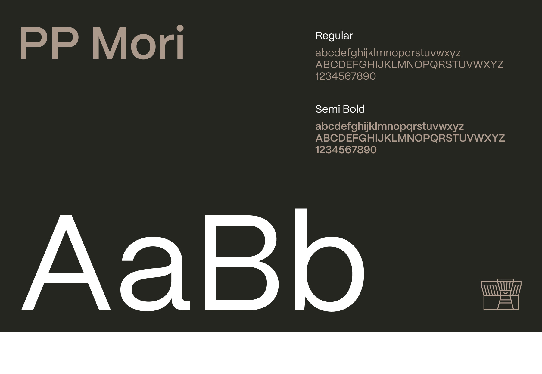
For the visual identity of the Villanovafranca Foundation, the PP Mori font was chosen, a highly readable sans serif that guarantees clarity and typographic consistency in all levels of communication, from the headlines to the body of the text.
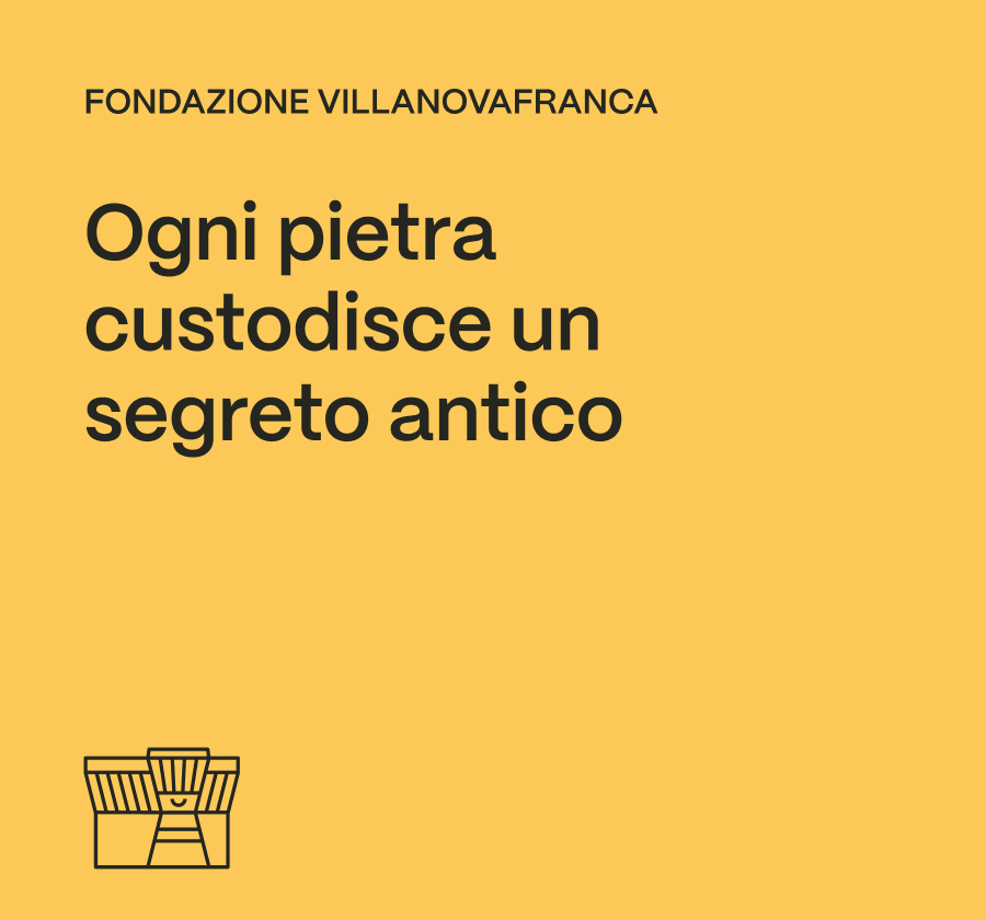
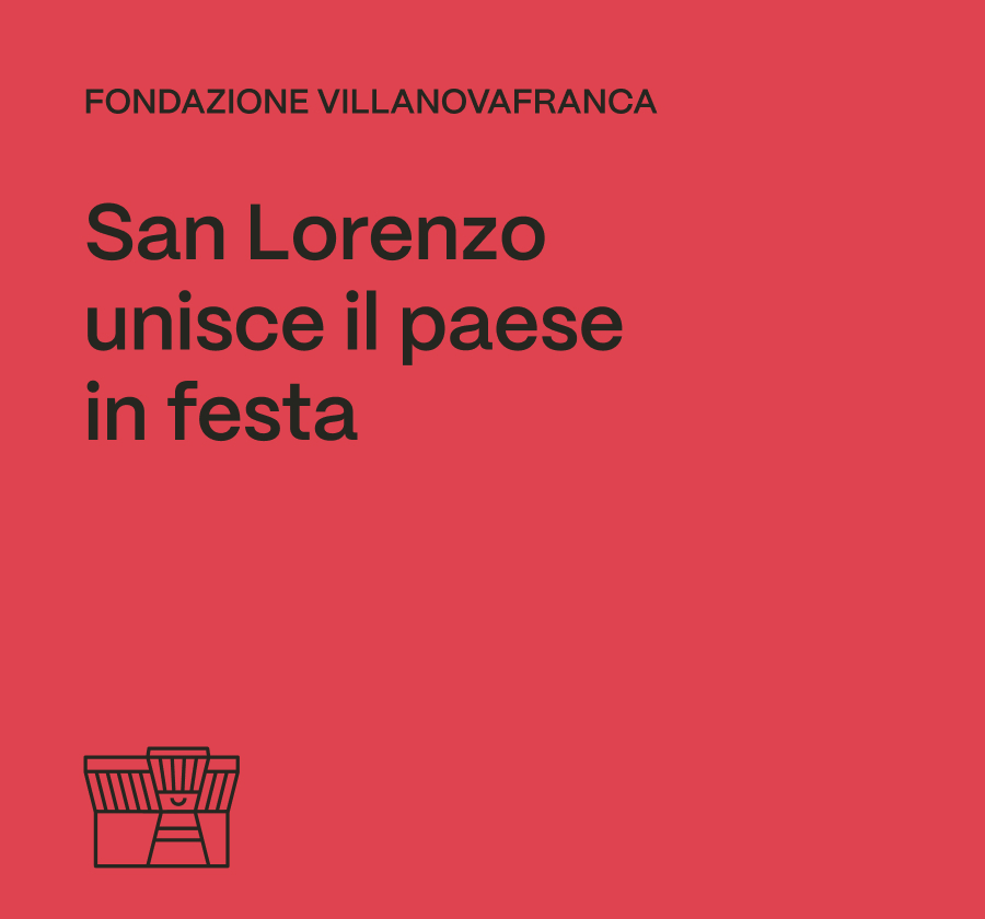
The colour palette includes black, brown, purple, yellow and red, each with a strong symbolic connection to the territory. Black and brown act as neutral tones, with brown recalling cultural heritage and the earth. Purple is inspired by the saffron flower, yellow by the local sandstone, and red symbolises San Lorenzo, the patron saint of Villanovafranca.
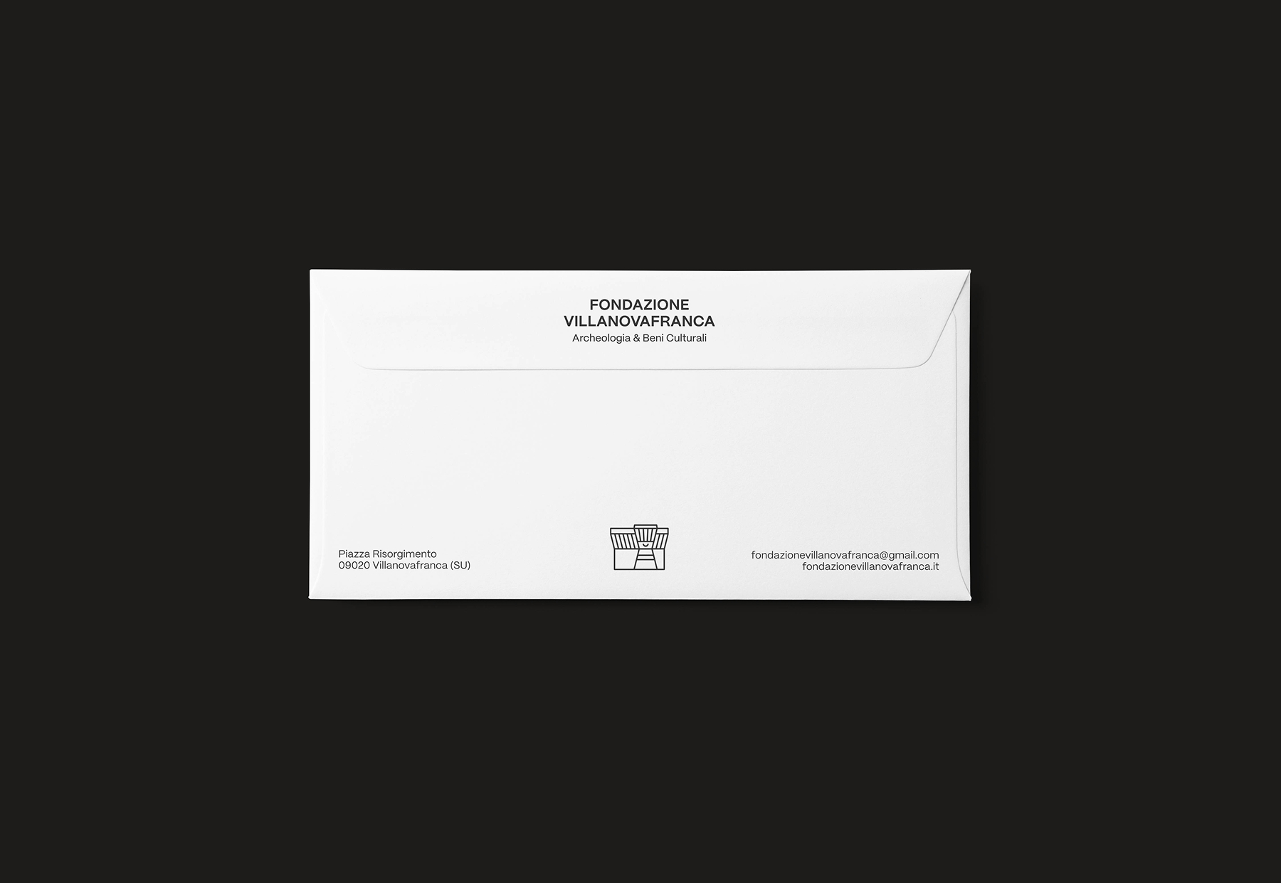
The new corporate image of the Villanovafranca Foundation was applied to the main institutional communication tools, including letterheads, envelopes and business cards. These media reflect the renewed visual identity of the Foundation, helping to reinforce consistency and brand recognition in every formal context.
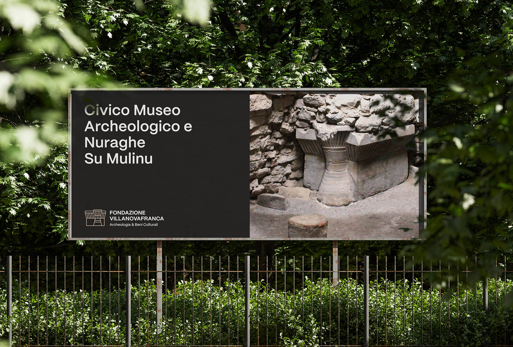
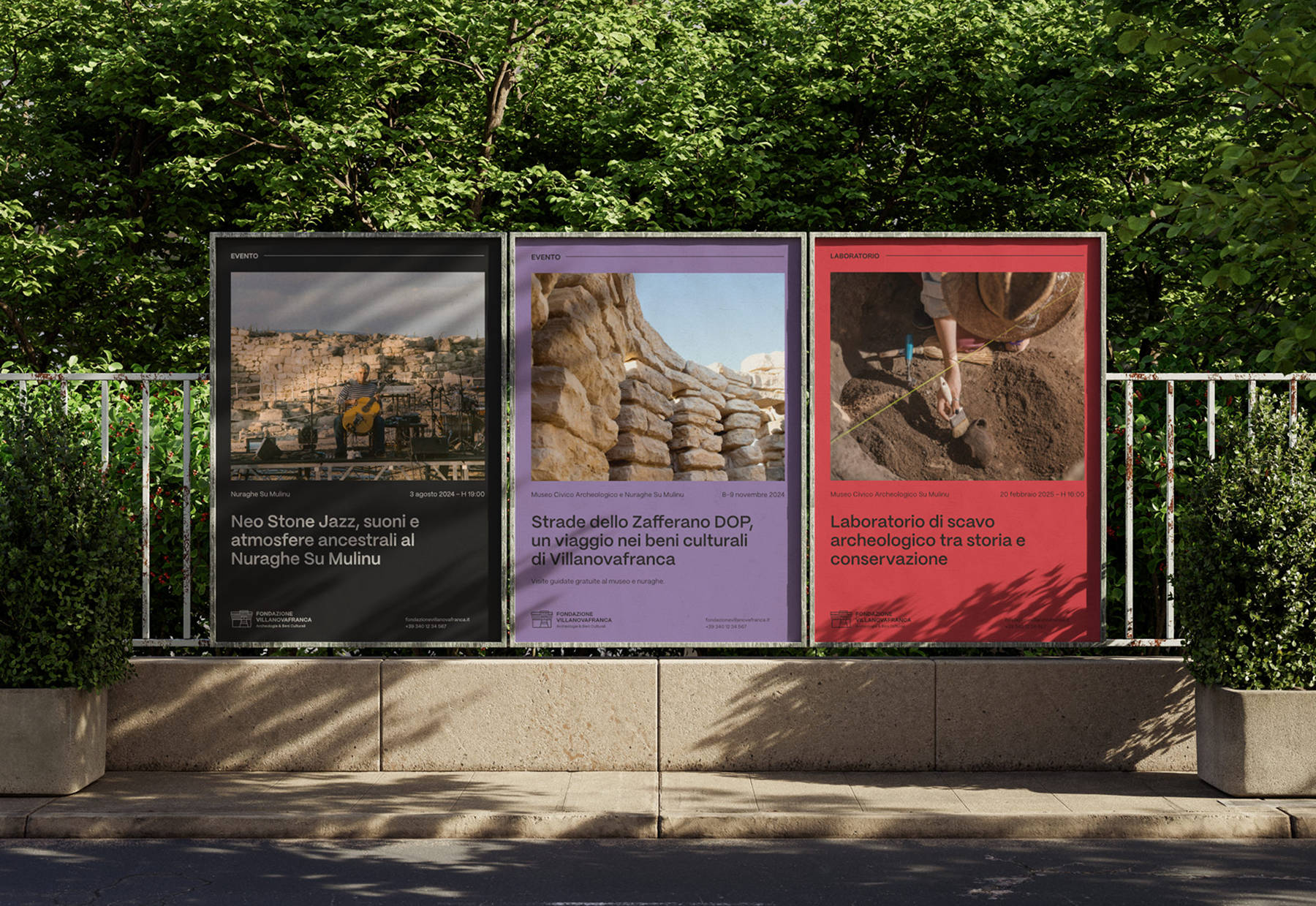
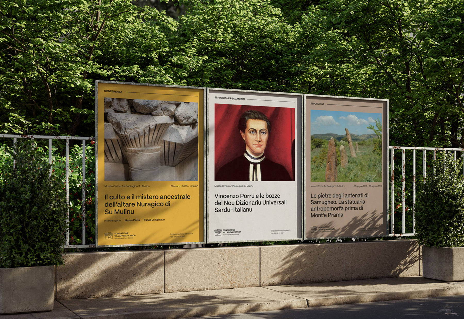
The corporate image was also applied to the design of advertising posters and promotional material for events. This use makes it possible to maintain a coherent visual communication also in public spaces, reinforcing the recognisability of the Foundation and enhancing its presence in the territory during cultural and institutional initiatives.
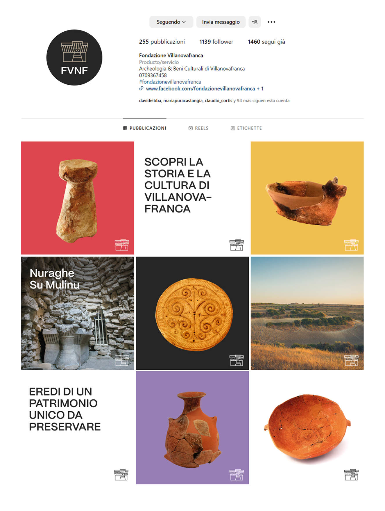
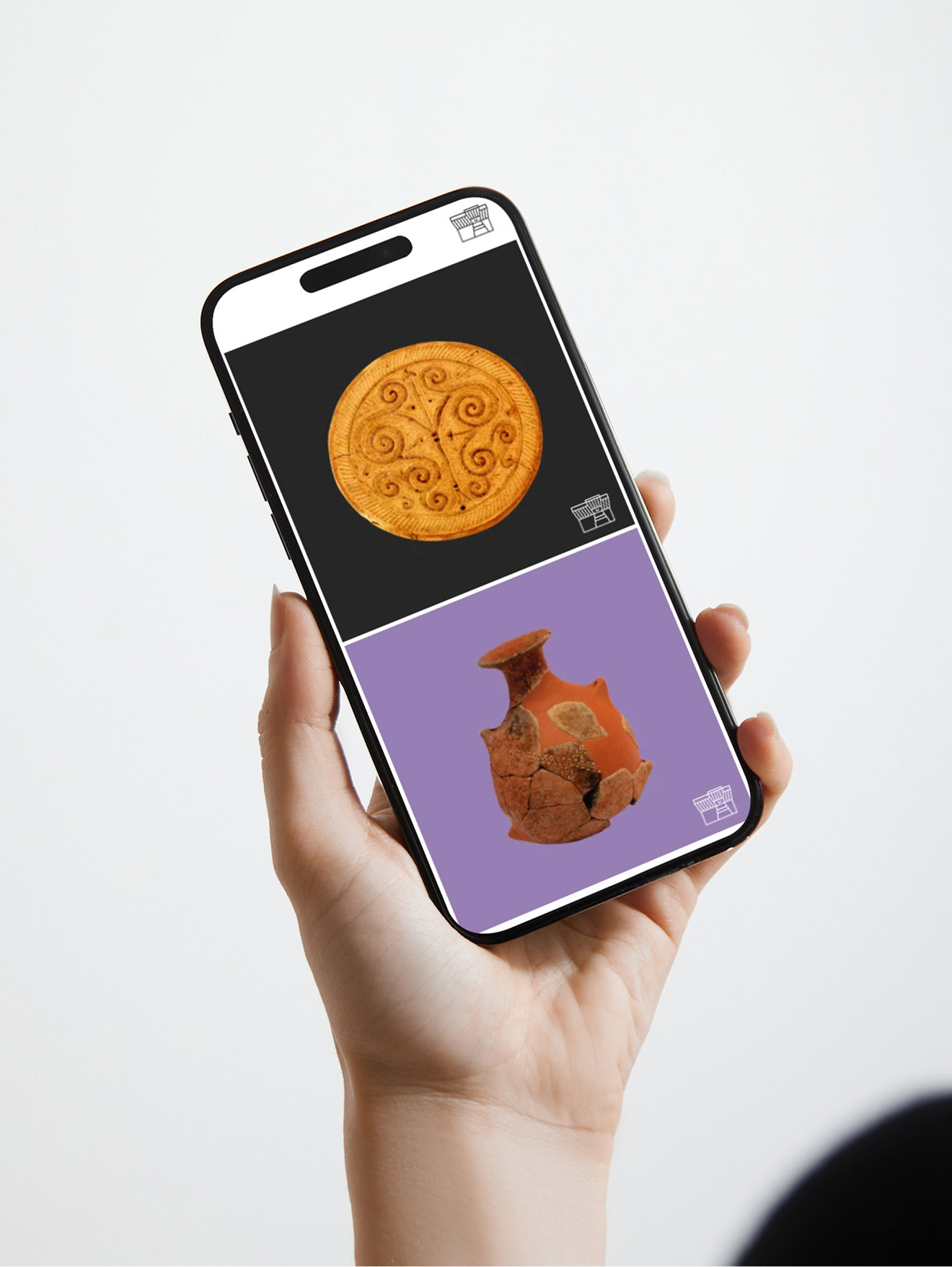
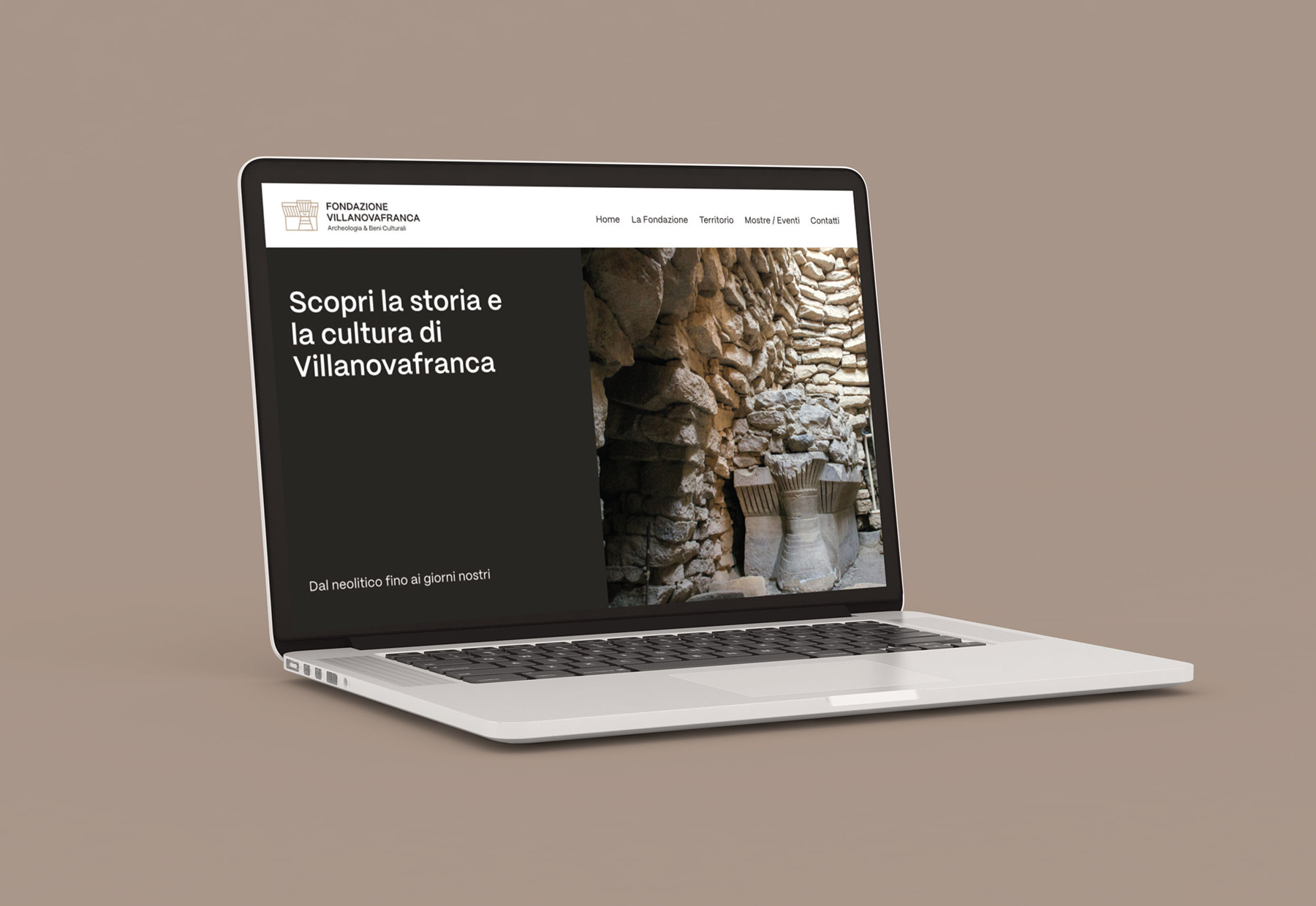
The corporate image was implemented in the Foundation’s social channels, ensuring visual consistency also in daily digital communication. As far as the website is concerned, we proposed a graphic line consistent with the visual identity developed, even though the technical realisation of the site was not taken care of directly by us.
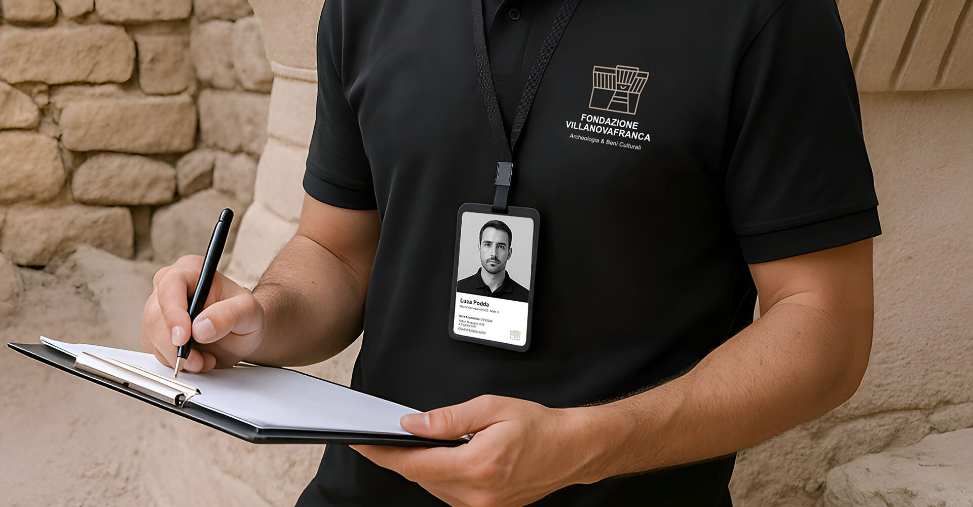
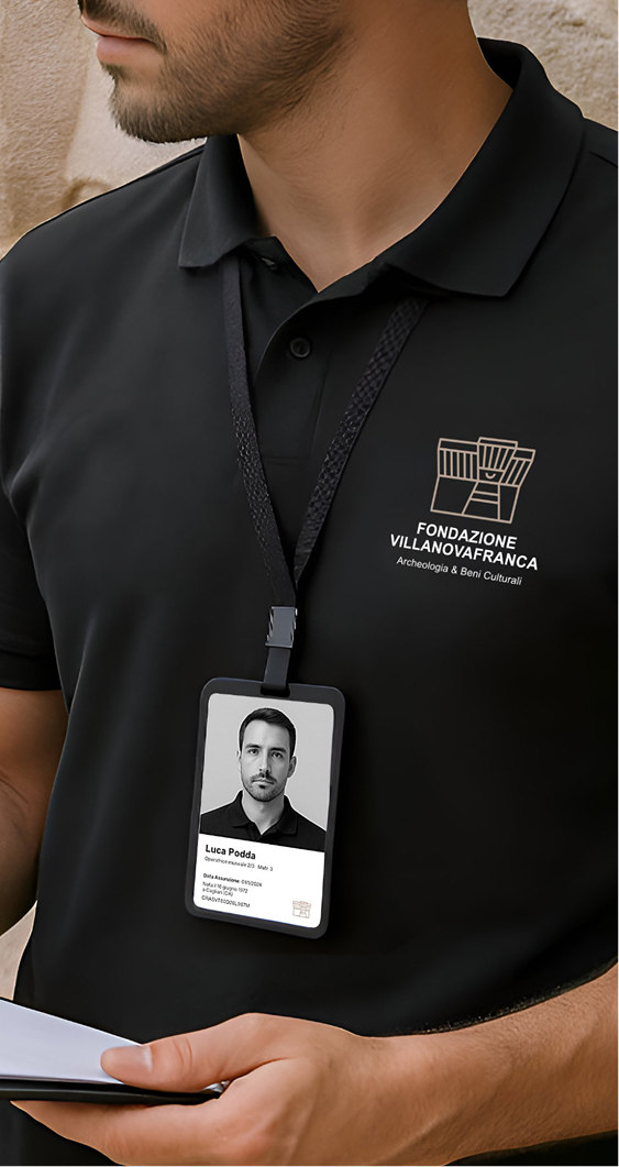
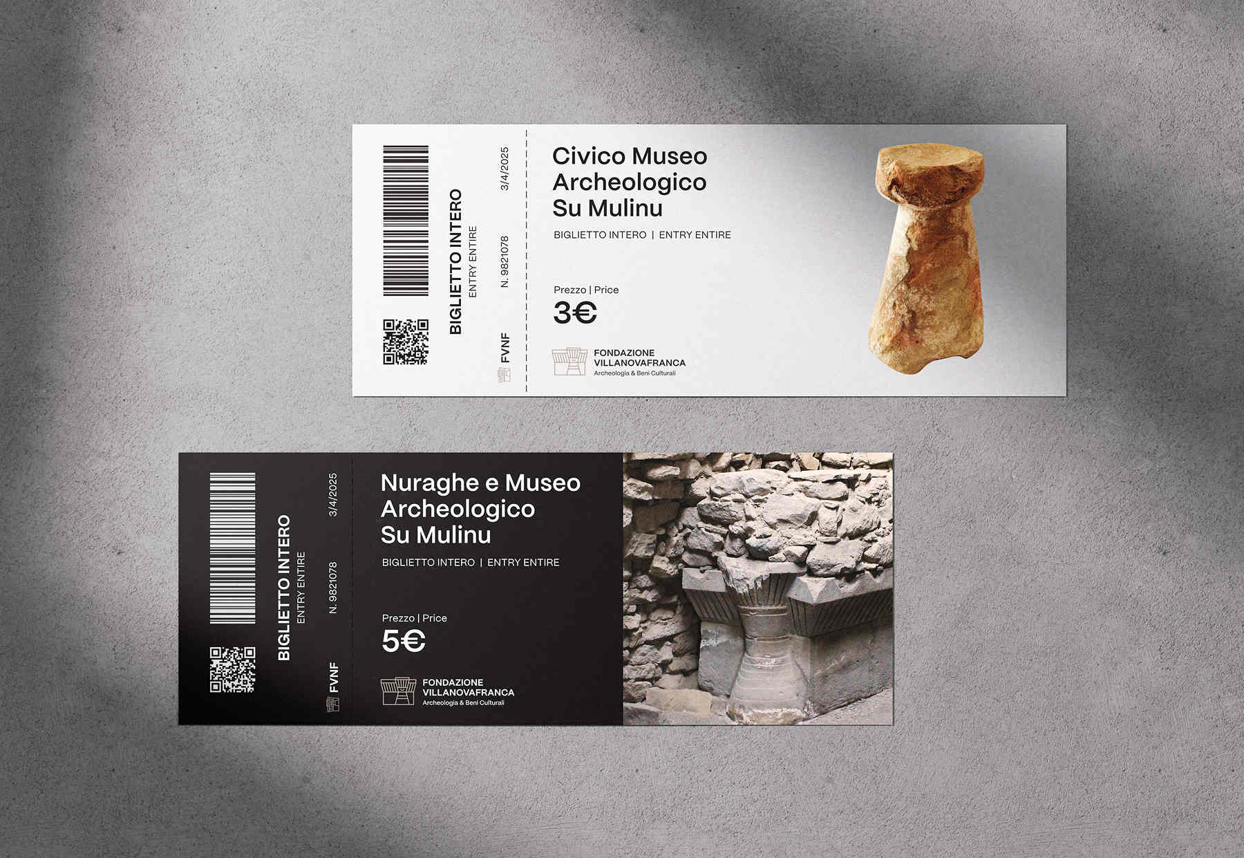
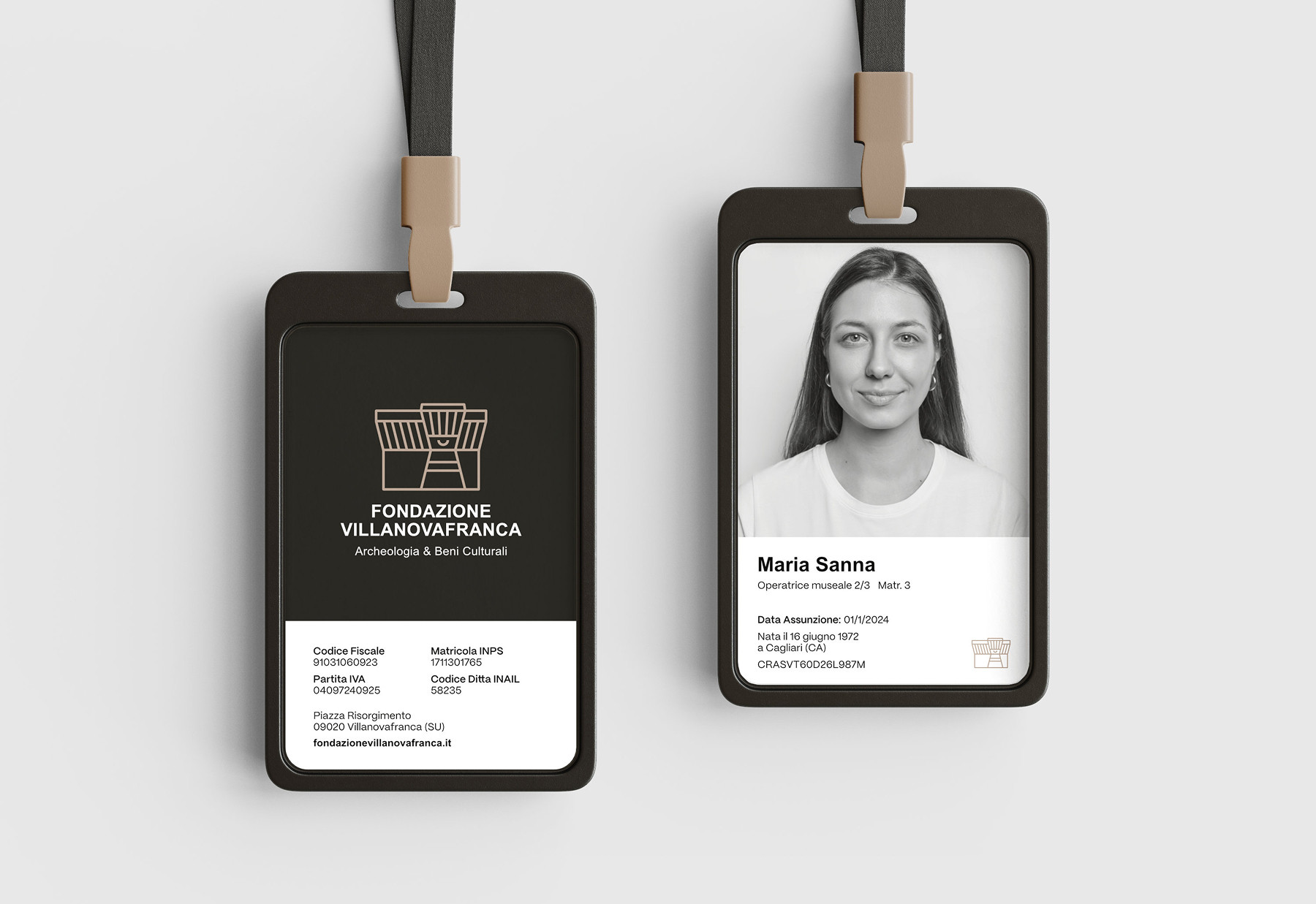
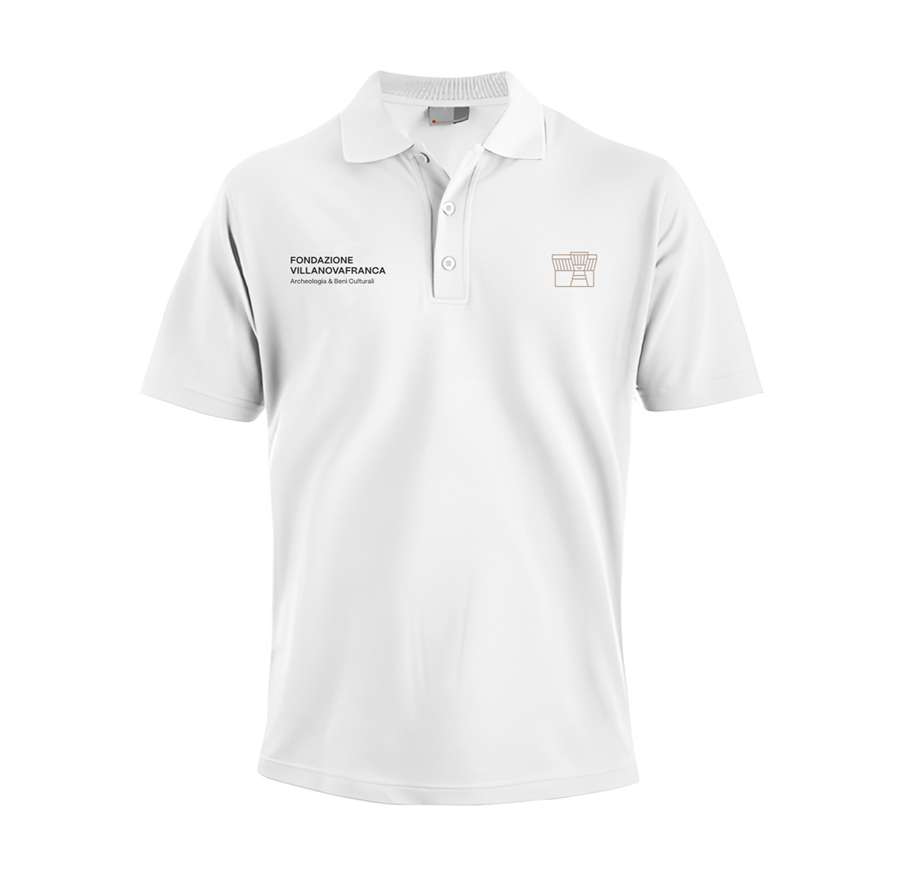
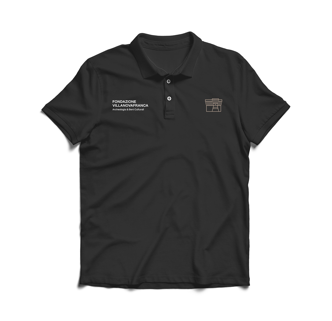
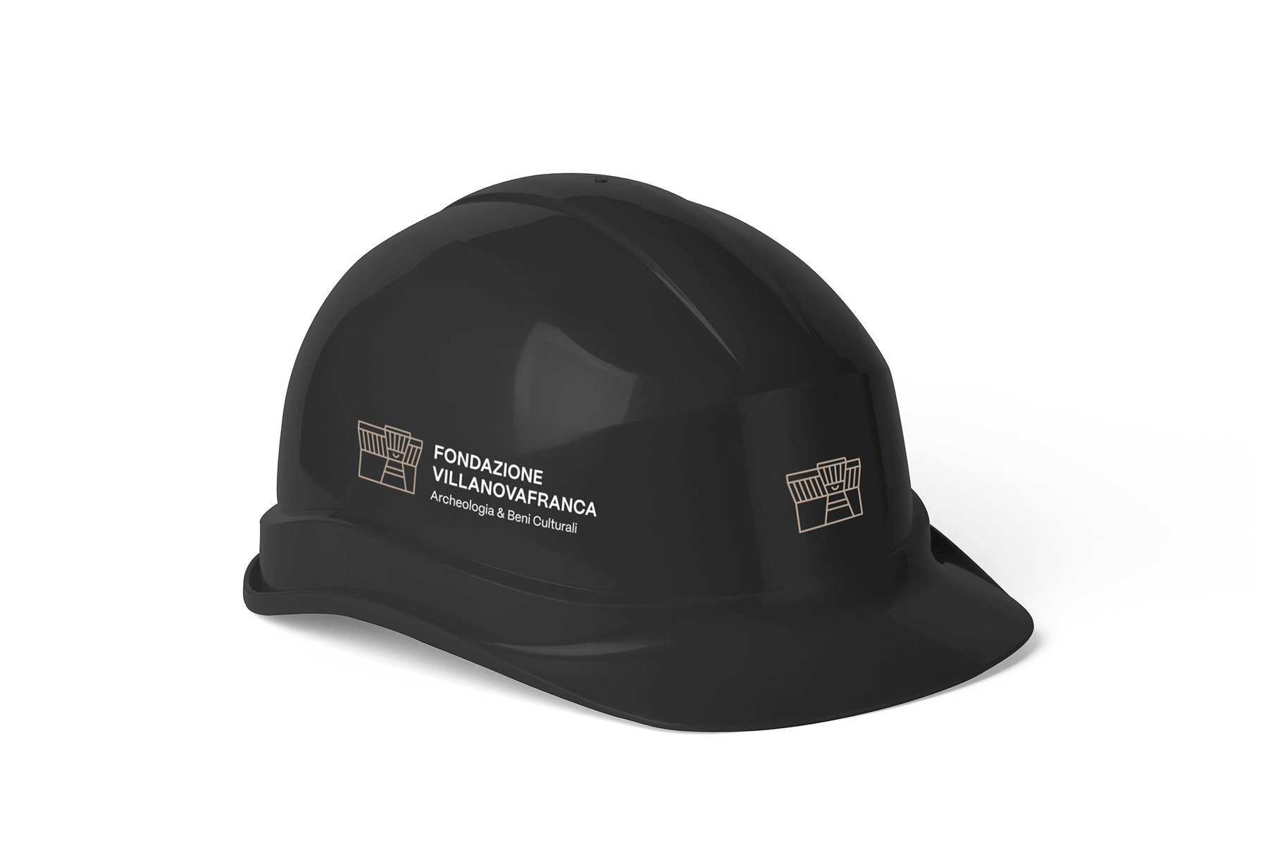
The visual identity of the Foundation is clearly recognisable in various elements, such as the entrance tickets to the places of culture, guide badges and staff uniforms. This constant presence reinforces the visitor experience, creating a consistent visual link that accompanies and enriches every moment of the visit.
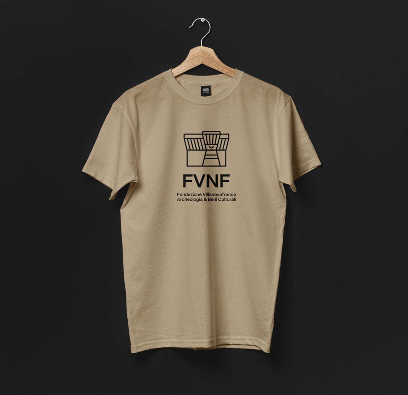
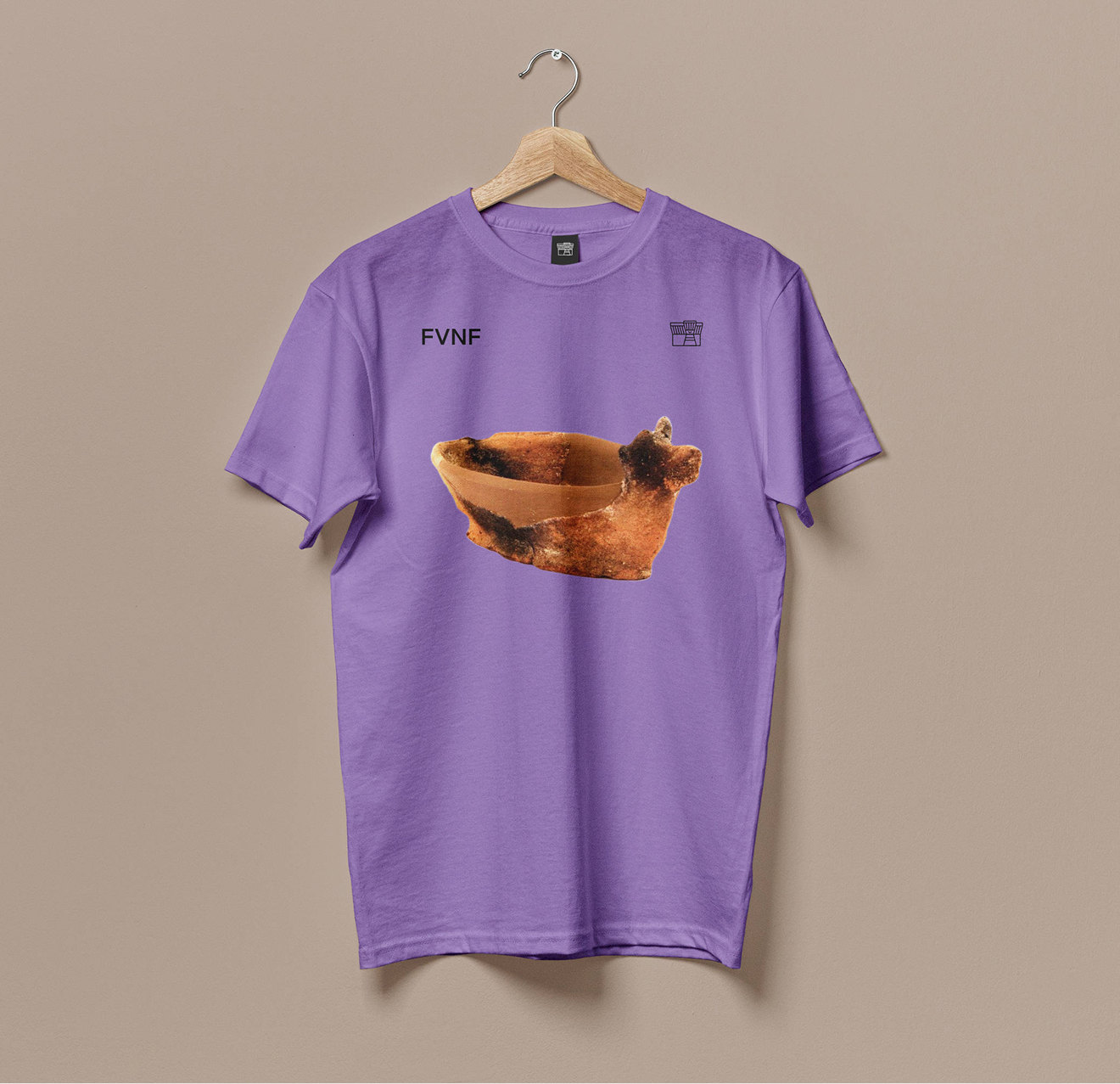
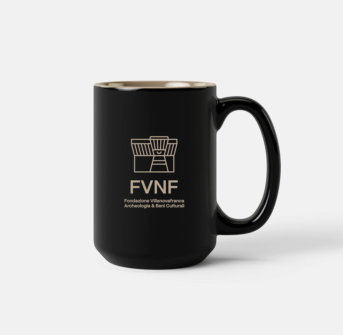
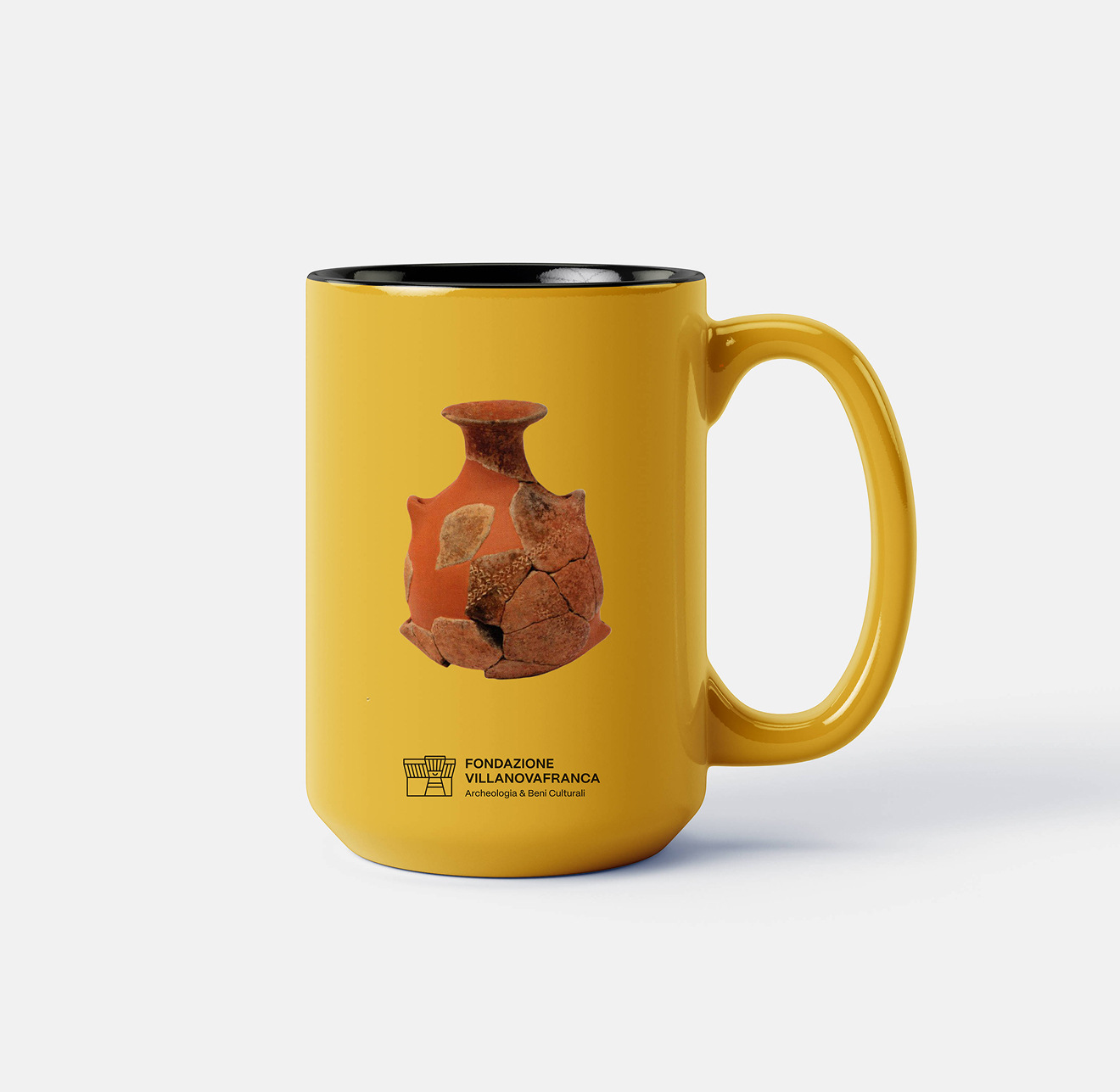
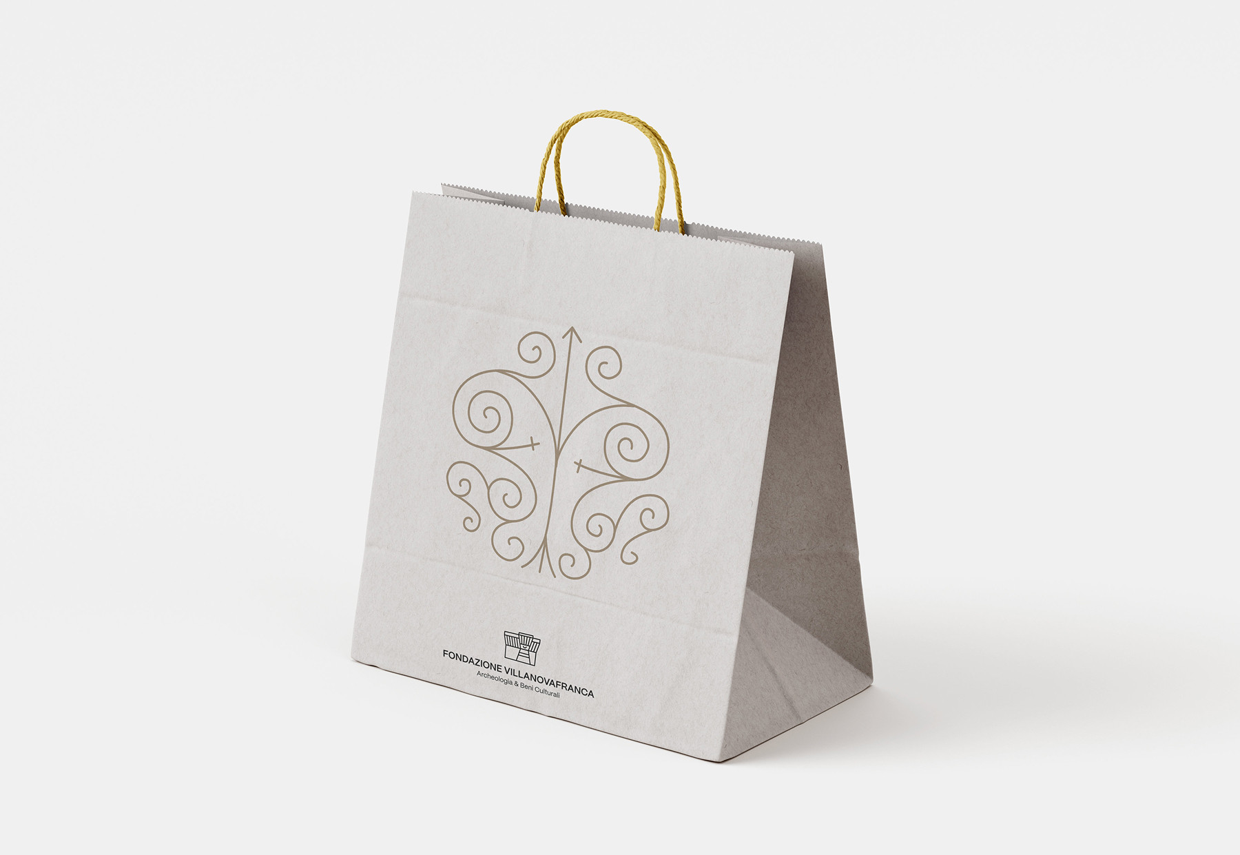
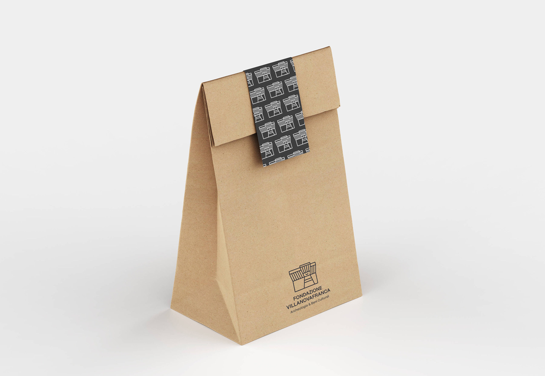
The corporate image has also been applied to a dedicated merchandising line, designed to promote the Foundation’s identity and offer visitors a tangible reminder of their experience. The articles, with attention to detail and consistent with the new visual identity, also include the envelopes delivered with the purchase, helping to spread the values of the Foundation beyond the borders of the territory.