In the world of journalism, newspaper editorial design is crucial to ensure that information is presented in a clear, readable and visually appealing way. At our graphic design studio, we specialise in creating layouts that not only capture the essence of the news, but also facilitate an optimal reading experience for readers. In this article, we will explore the essential elements of newspaper design, from the layout of information to the visual coherence of images and text.
Layout of information: clarity and readability
The layout of information in a newspaper is essential to keep the reader’s attention and ensure that the news is easily understood. Key aspects include:
- Visual hierarchy: We use a clear hierarchy of headlines, subheadings and body text to guide the reader through the content. Headlines should be prominent and attention-grabbing, while subheads and body text should be well organised.
- Well-defined sections: Each section of the newspaper should be clearly delineated, making it easy for readers to quickly find the information they are looking for, whether it is local news, international news, sports or entertainment.
- Adequate spacing: maintain adequate spacing between columns and sections to avoid cluttering the page and improve readability.
In this way we will ensure that the distribution of information is intuitive and easy to follow, improving the reading experience and confirming that each news item stands out properly.
Typography: legibility and coherence
Typography plays a crucial role in newspaper design, as it must be legible and consistent throughout the pages. Important elements include:
- Clear and legible fonts: we choose fonts that are easy to read in different sizes, both in headlines and in the body of the text. Typography should be clear and professional.
- Typographic consistency: we maintain typographic consistency throughout the newspaper, using variations of the same typeface family to maintain a uniform and professional appearance.
- Appropriate style and size: we adjust the size and style of the typeface according to the importance of the information, ensuring that the headlines are eye-catching and the body text is easily readable.
In such a way the reader will understand the importance of typography in the presentation of the news and we will ensure that each typographic choice contributes to a comfortable and effective reading.
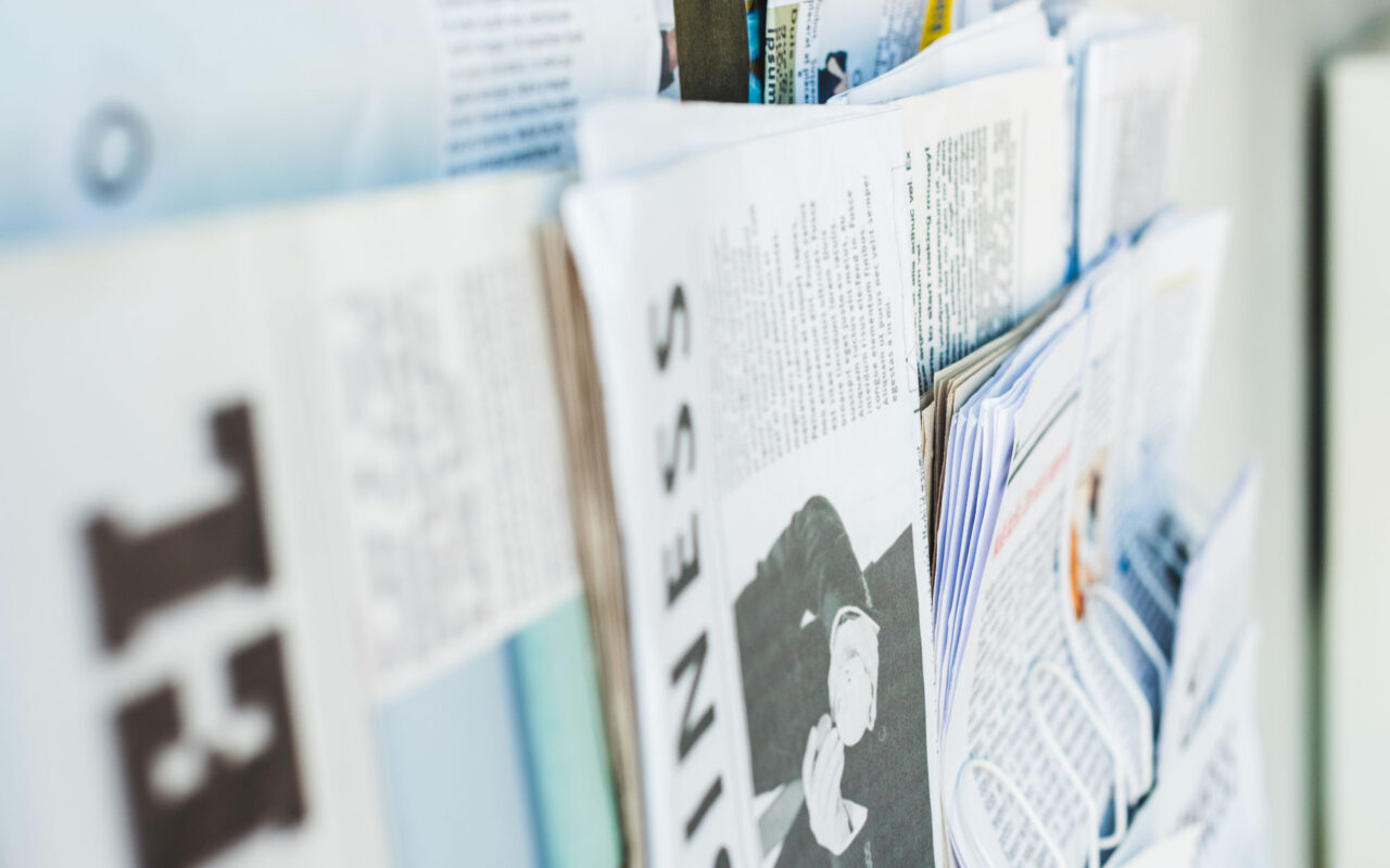
Images: relevance and quality
Images in a newspaper should complement and enrich the content of the text. To achieve this, we focus on:
- Relevance of images: each image should be directly related to the content of the article, providing context and helping to illustrate the story.
- Image quality: we use high quality images that are sharp and clear, avoiding any distortion that may distract the reader.
- Strategic placement: we place images strategically within the design, ensuring that they do not interrupt the flow of the reading, but complement it.
In short, we will carefully select and place images so that they are not only visually appealing, but also add informative value to each article.